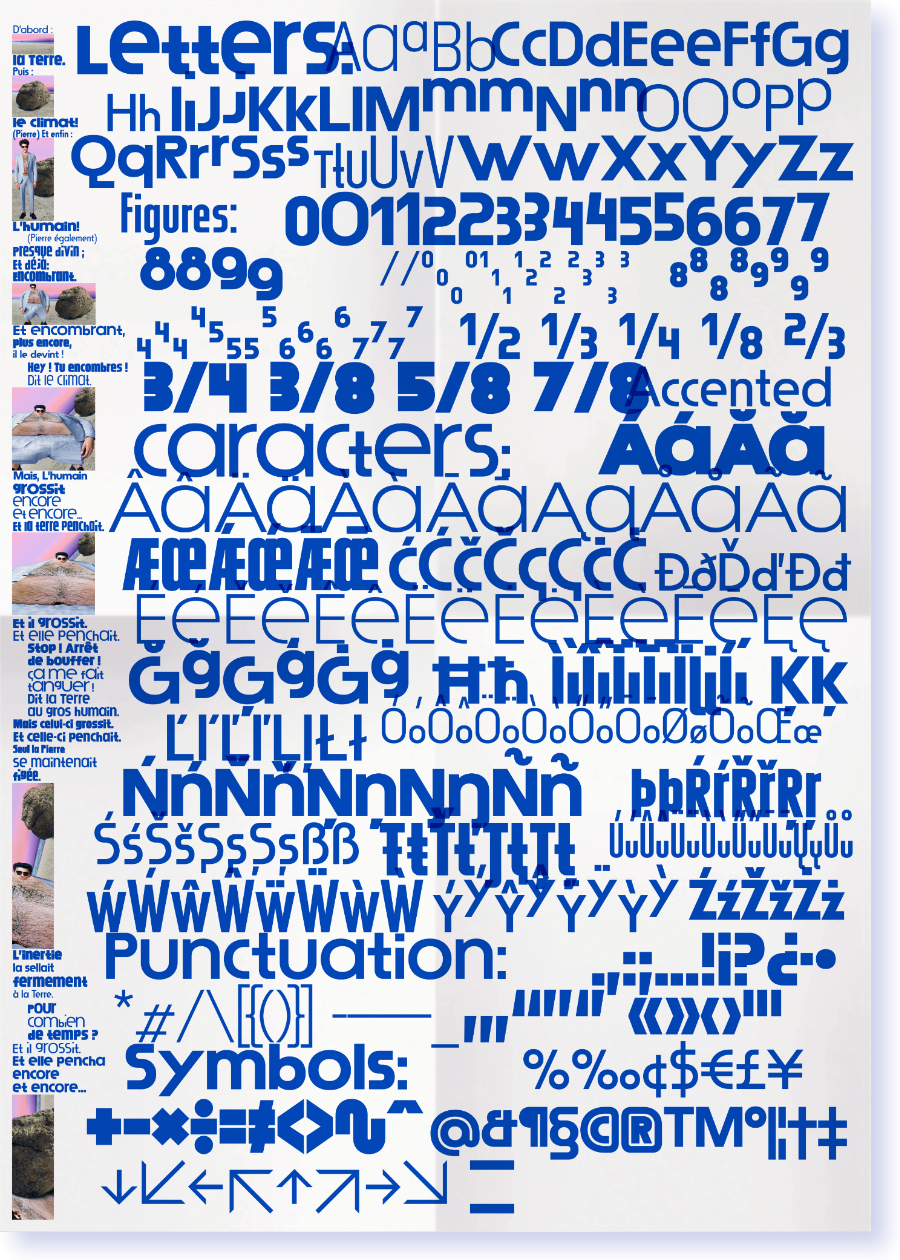
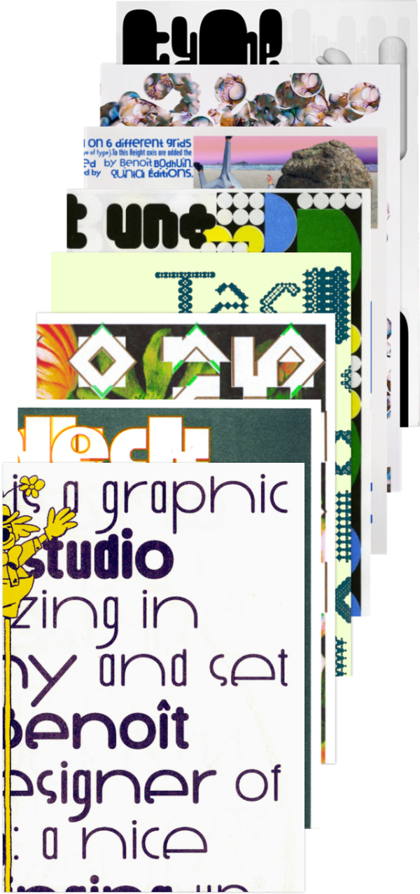
Typefaces & Products
Typefaces are sent by email in otf, woff and woff2 with a desktop and web license for 1 user.
License agreement and fonts infos (pdf)
Download trial fonts (AB… ab… 01…)
Don't hesitate to send me an email for any questions, student prices (−66%), new glyphs needed, custom font… Fonts are sent by email, it takes a few minutes, be patient. 😉
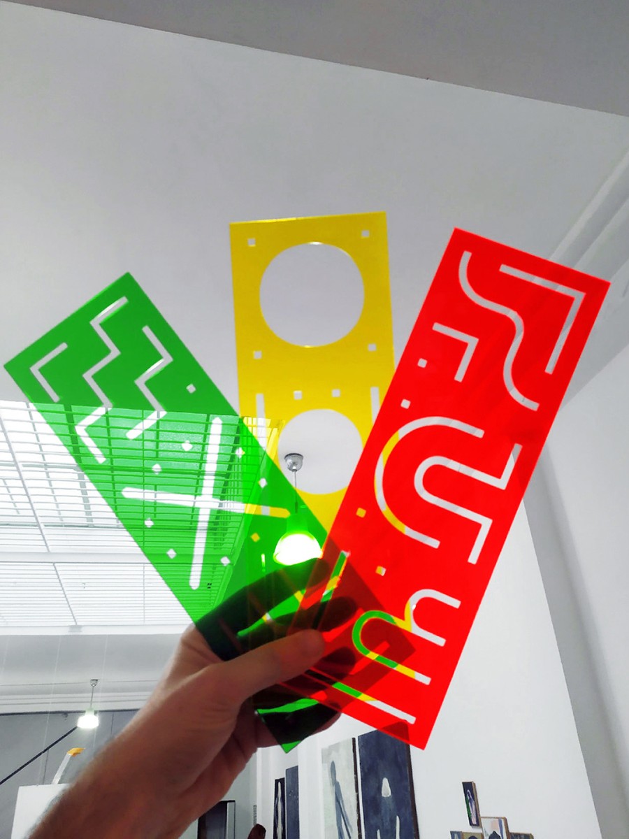
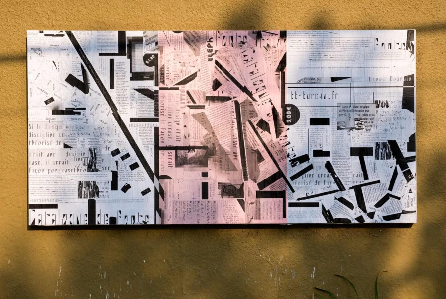
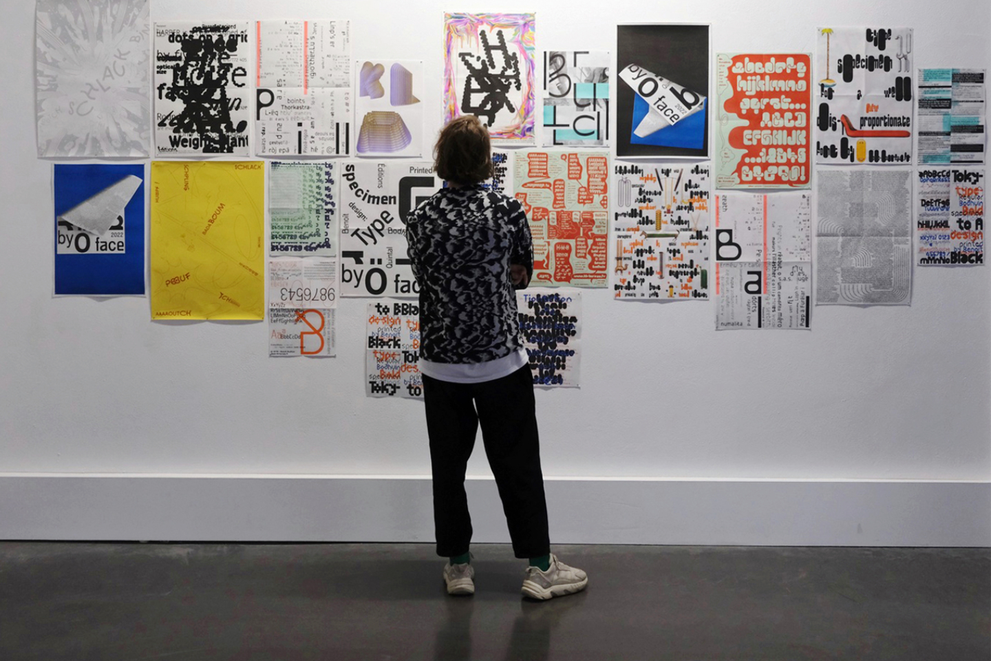
bb-bureau
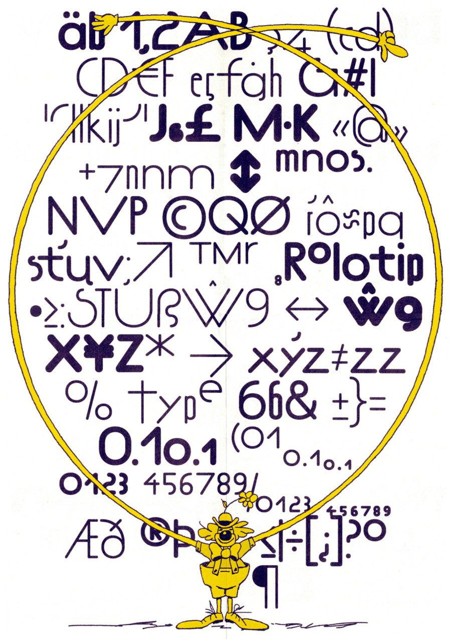
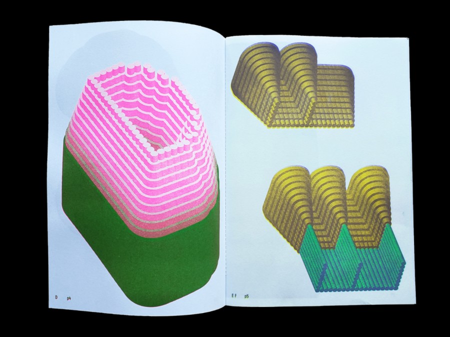
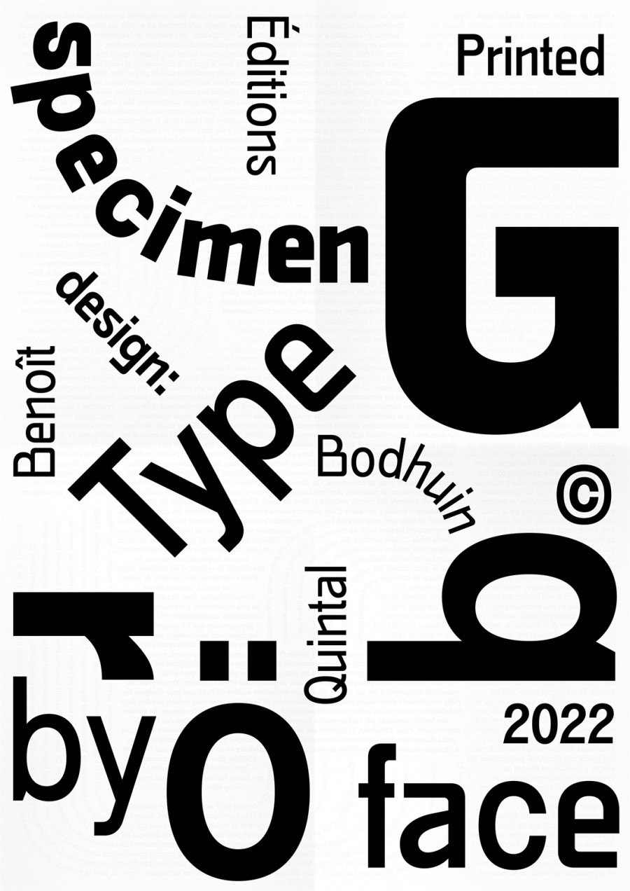
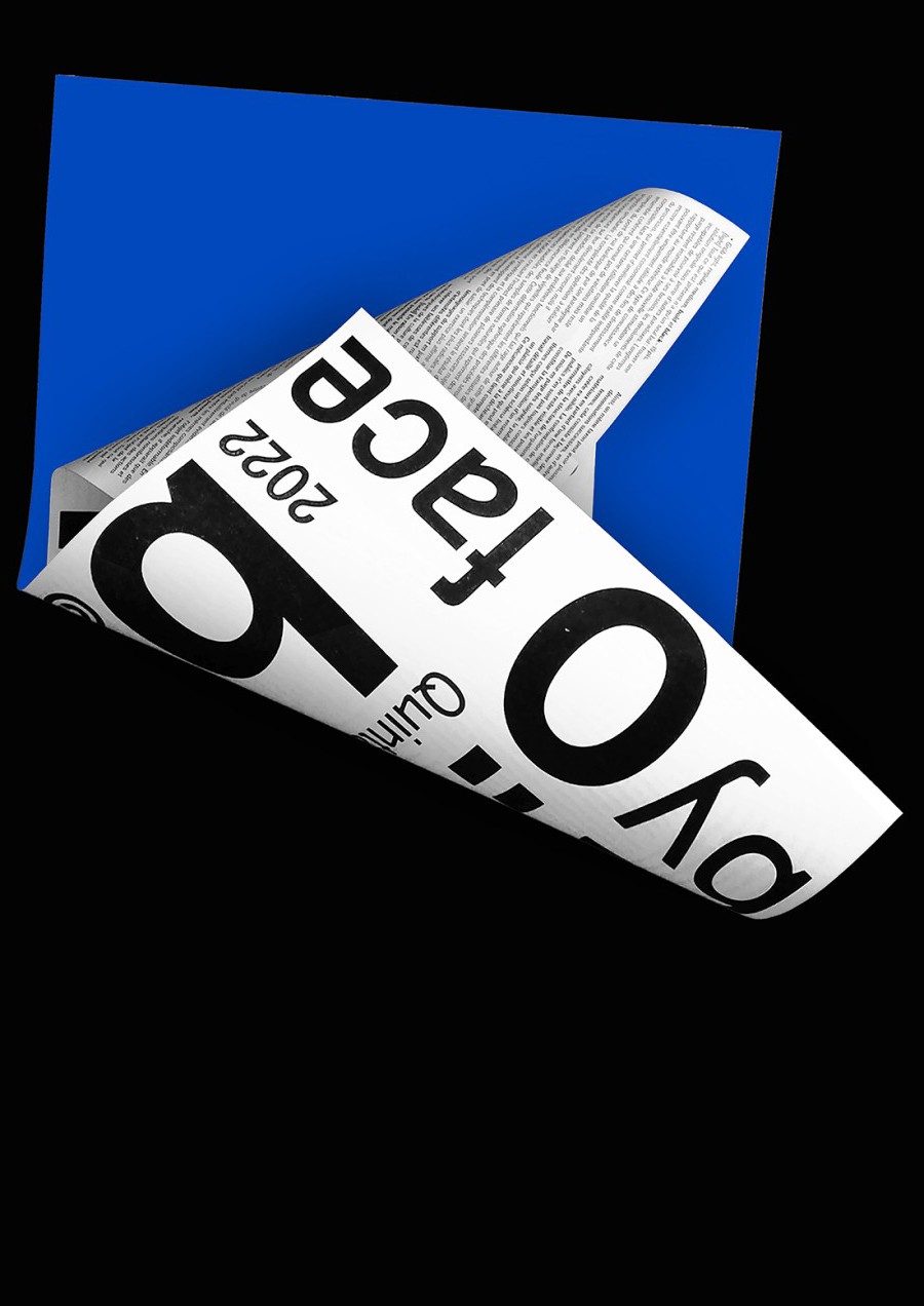
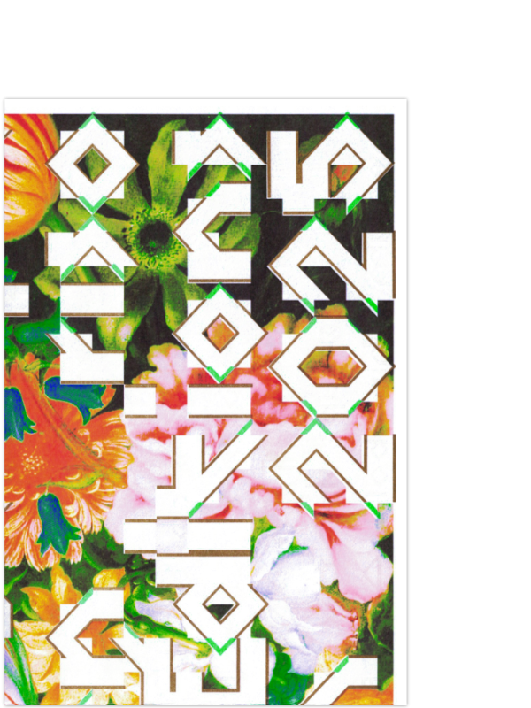
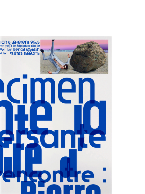
Rolotip specimen (back), both sides A3 poster 2 colors riso printing by Quintal Éditions.
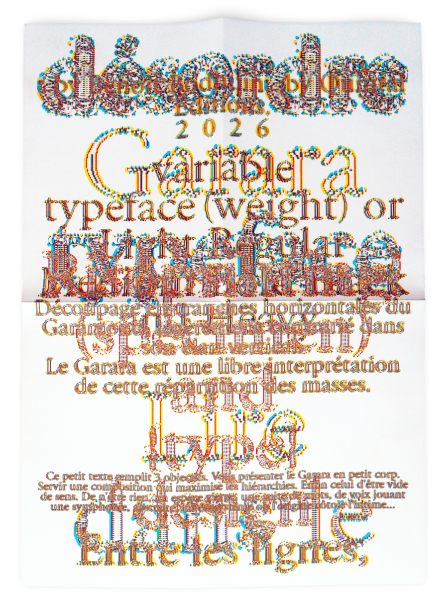
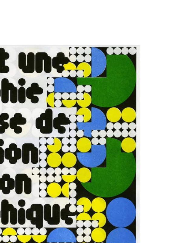
Garara specimen, both sides A2 poster 4 colors riso printing by Quintal Éditions.
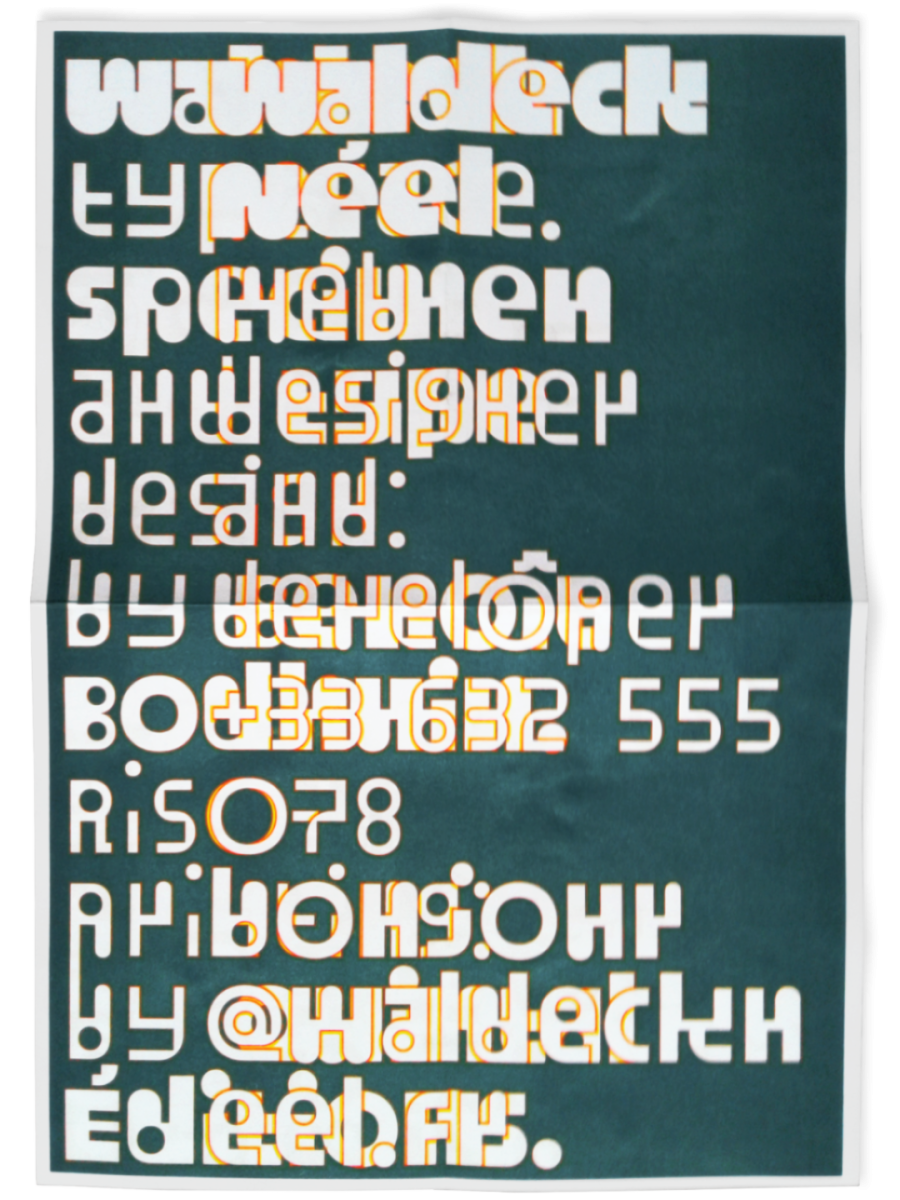
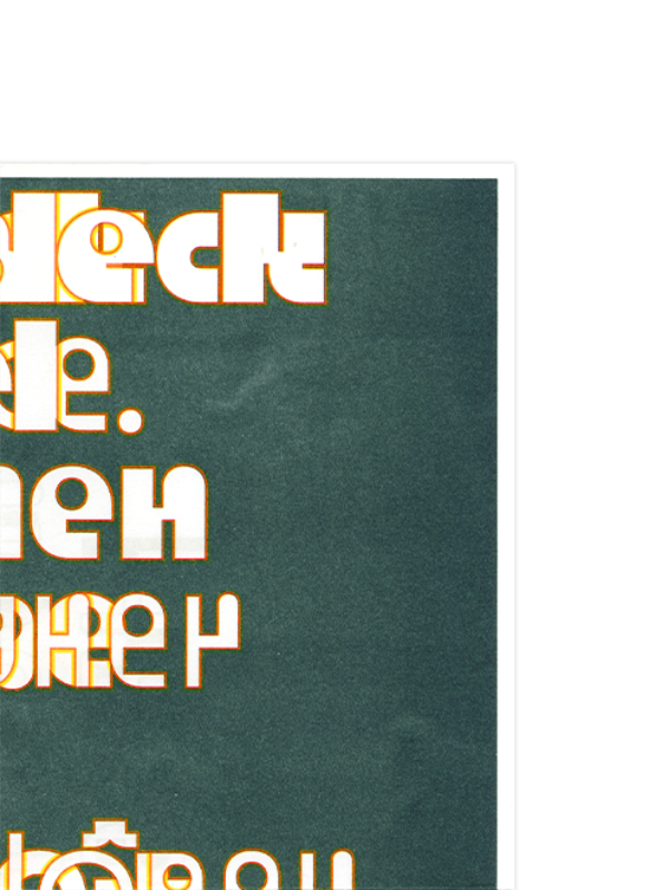
Waldeck specimen, both sides A3 poster riso printing by Quintal Éditions.
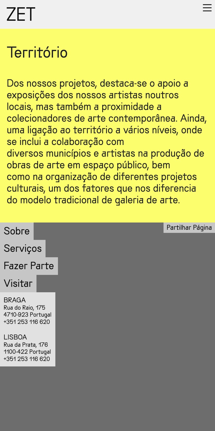
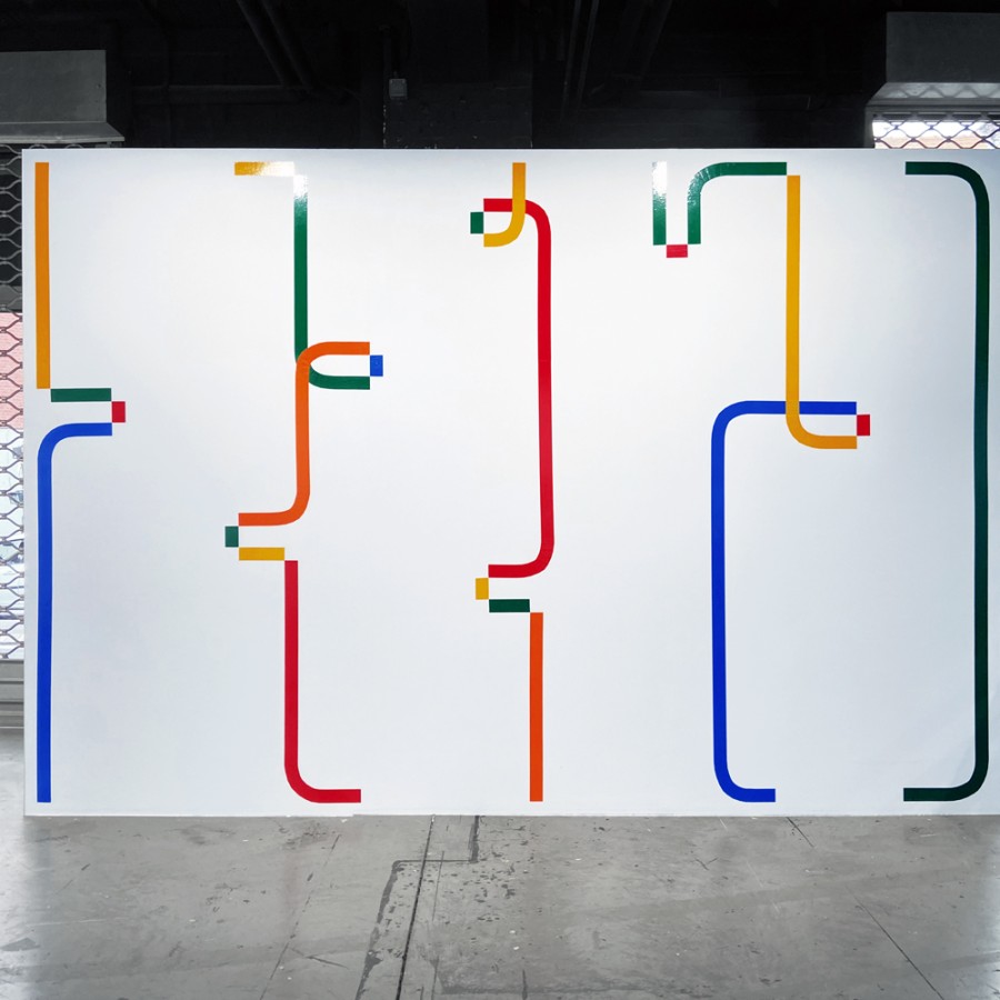
Custom version of GroteskRemix typeface for MUZEU and ZET Galeria commissioned by Macedo Cannatà.
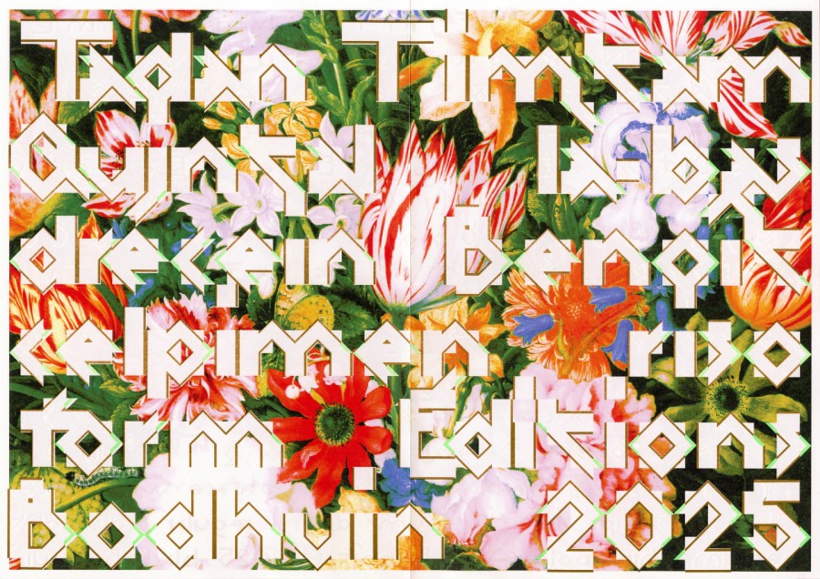
Timtam specimen, both sides A3 poster riso (fluo green and gold) + laser printed by Quintal Éditions.
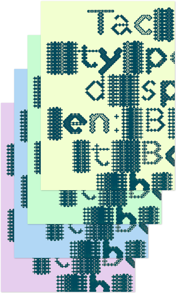
Tacmitac specimen, both sides A3 poster riso printed (green hunter) on colored paper by Quintal Éditions.
Resum specimen, both sides A3 4 colors riso poster printed by Quintal Éditions.
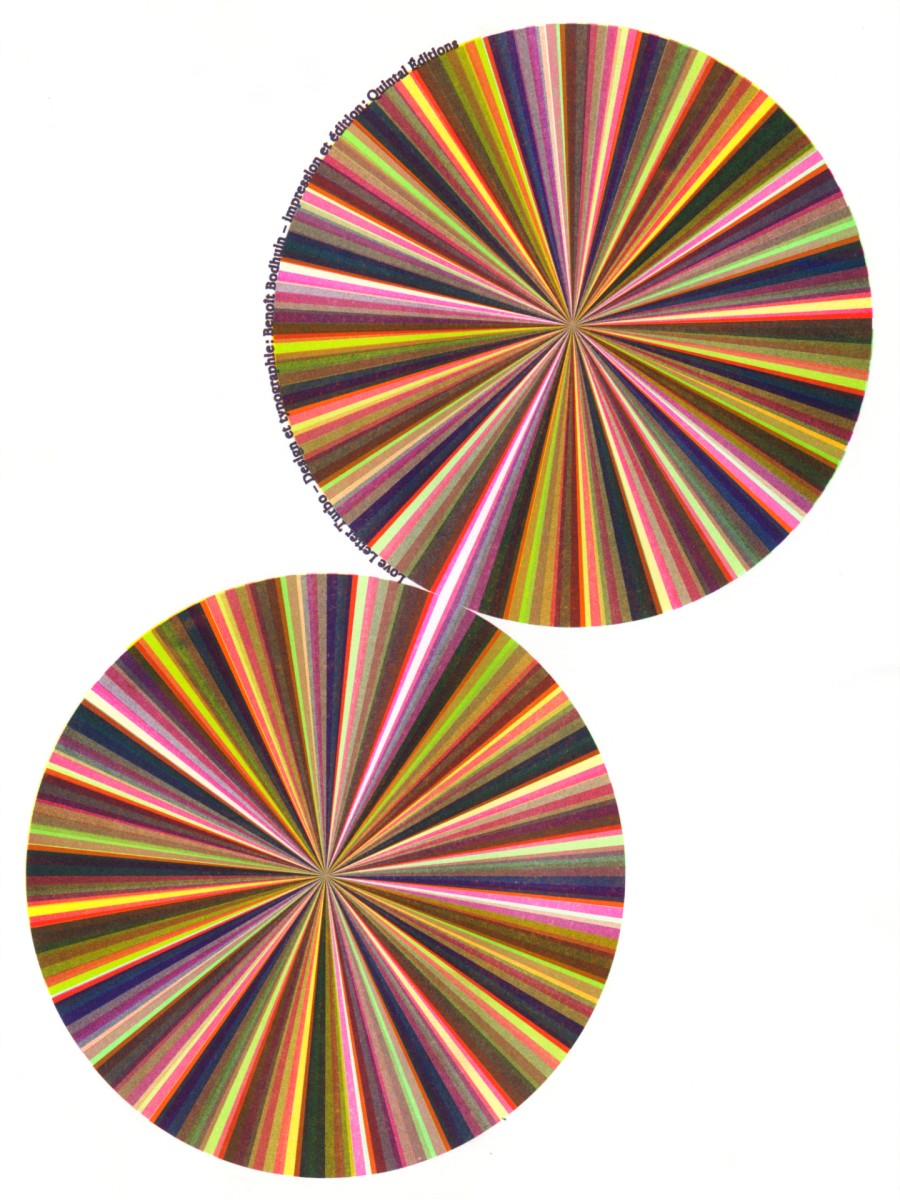
Poster for Love Letter Turbo printed by Quintal
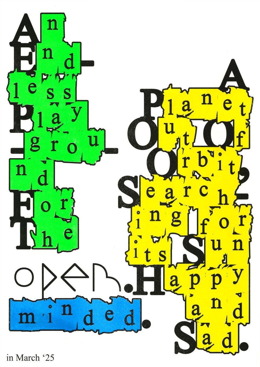
Posters for Ankali & Planeta Za
Topomobo specimen.
Topomobo – Atelier itinérant du Centre Pompidou [more soon]
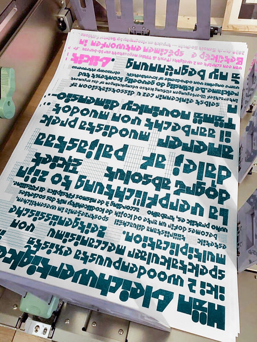
Politip specimen, both sides A3 4 colors poster riso printed by Quintal Éditions on Munken Print White 115g.
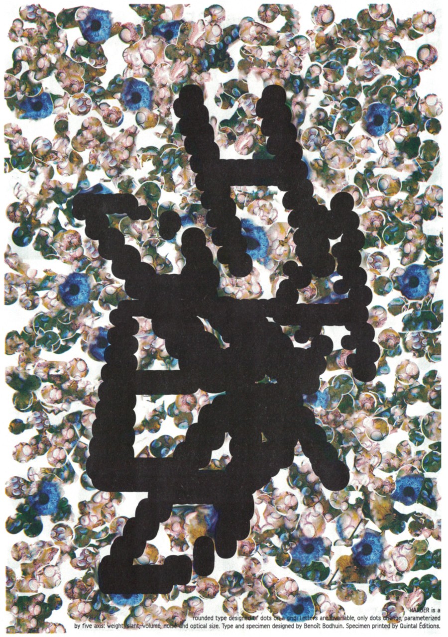
Dotss – A4 24-page riso zine. A typographic exploration around HARBER's caps. Cover silkscreened by Atelier PPP. Riso printed, published and distributed by Quintal librairie.
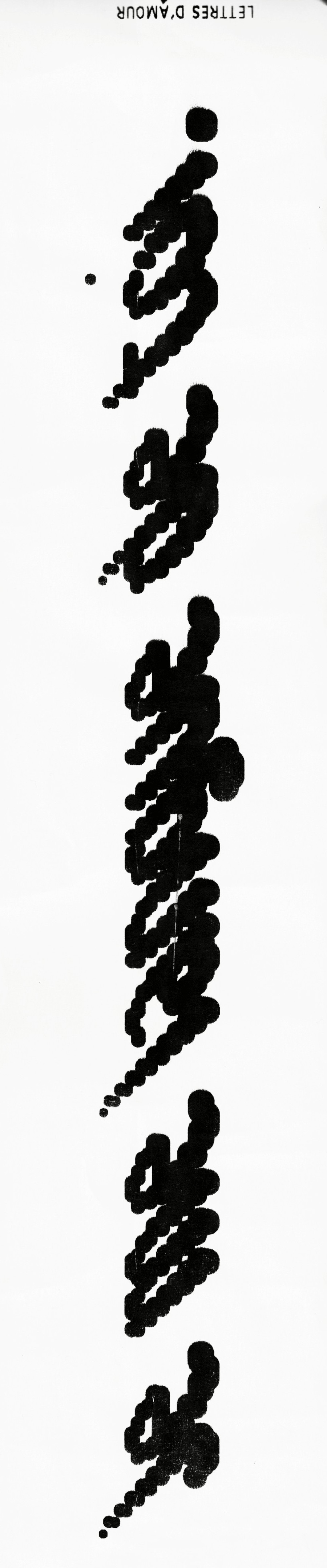
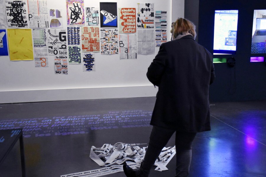
Lettres d’amour – installation at Bel Ordinaire – project with Maison des éditions and Julien Bidoret.
HARBER specimen, both sides riso A3 poster printed by Quintal Éditions. 4 colors on Munken Print White 115g.
Moki specimen, both sides A3 riso poster printed by Quintal Éditions. 3 colors on Munken Print White 90g.
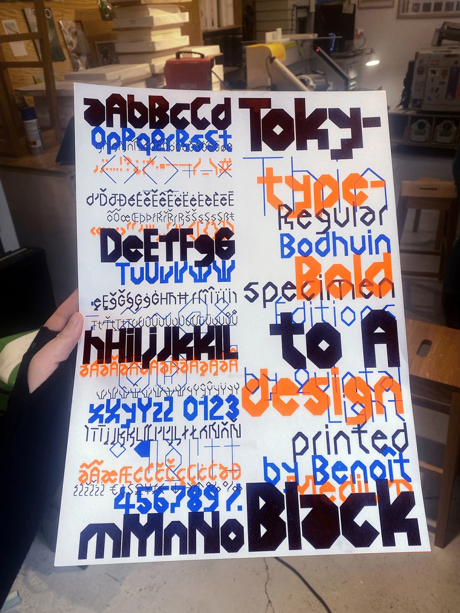
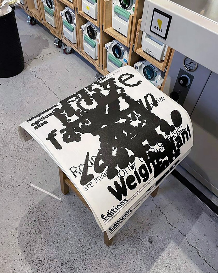
Tokyto specimen, both sides A3 riso poster printed by Quintal Éditions. 3 colors on Munken Print White 90g.
Poster for the 5 years exhibition of Quintal Éditions.
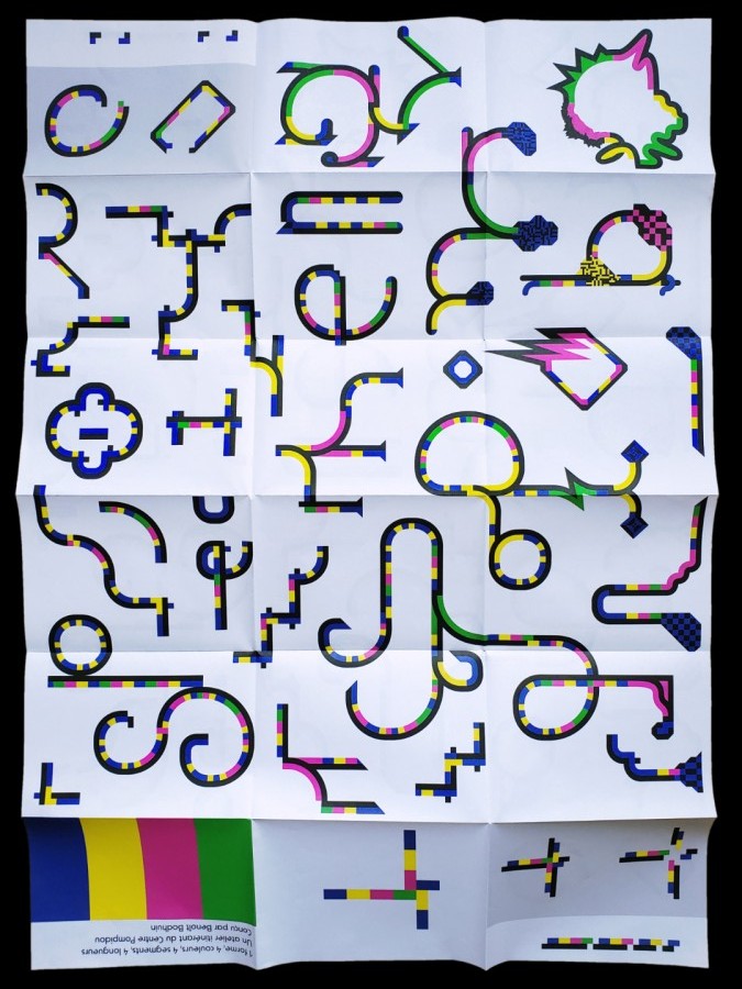
Drawing and Writing tool designed for a workshop at Soma curated by Fotokino.
« Il semble que le mot et le concept de zéro soient nés en Inde, sous le terme de sanskrit śūnya : “vacant”, “espace”. Autour du IXe siècle, il apparait sous la plume des savants arabes, où il devient sifr, “vide”. Le sifr entrera progressivement dans la langue française, avec l’introduction en Occident des mathématiques et de l’astronomie arabes. »
Contribution to Vacarme, collective exhibition curated by Les Mots Voyageurs at La Condition Publique.
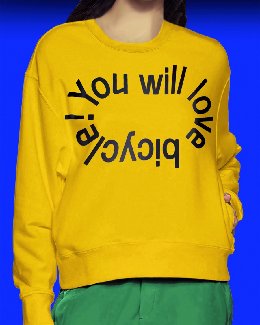
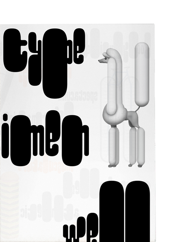
You will love bicycle! with Gröb typeface.
Gröb specimen and poster of the specimen, printed by Quintal Éditions. Specimen: both sides black on A2 Munken Print White 90g, folded A4. Poster: both sides black and blue on A2 Munken Print White 90g, rolled.
Pimpit specimen: both sides A2 poster, riso printed by Quintal Éditions, 4 colors on Munken Print White 90g.
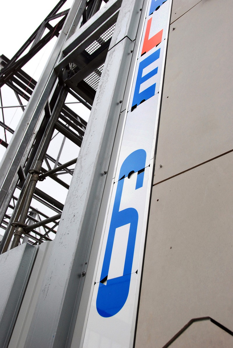
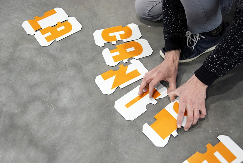
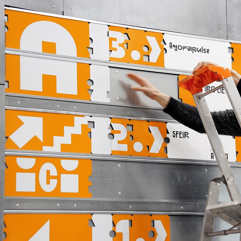
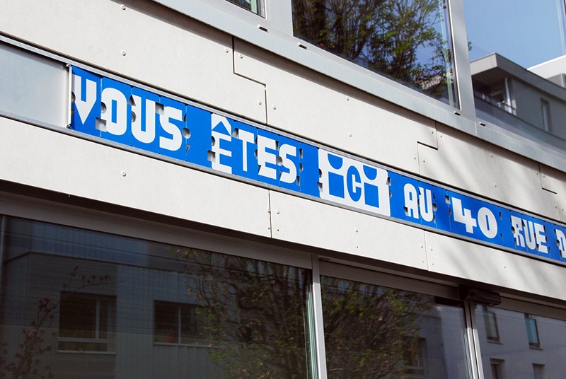
Lettering for modular signage system designed with Nicolas Gautron for La Halle 6 Est by Avignon-Clouet architects.
Gikit specimen: both sides poster, riso printed by Quintal Éditions, 3 colors on Munken Print White 90g, folded A4, open A2.
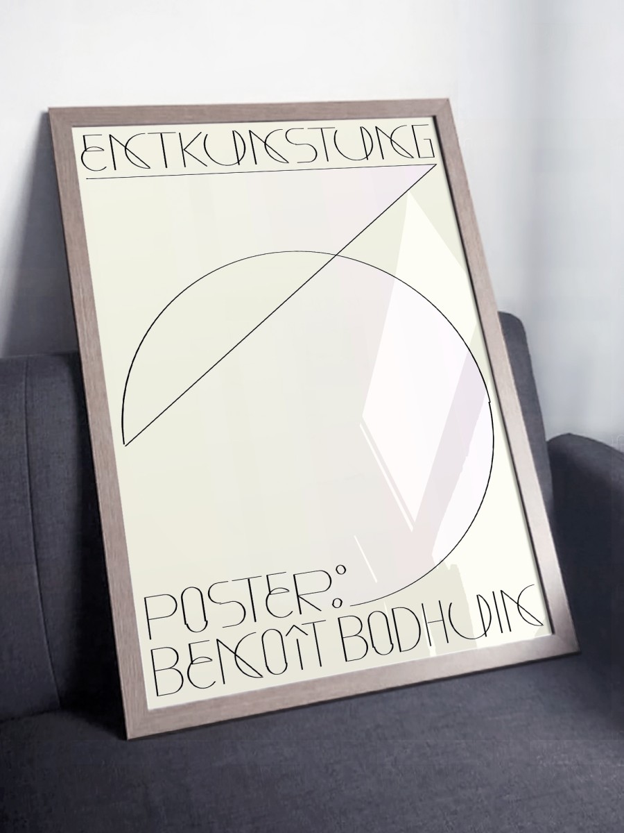
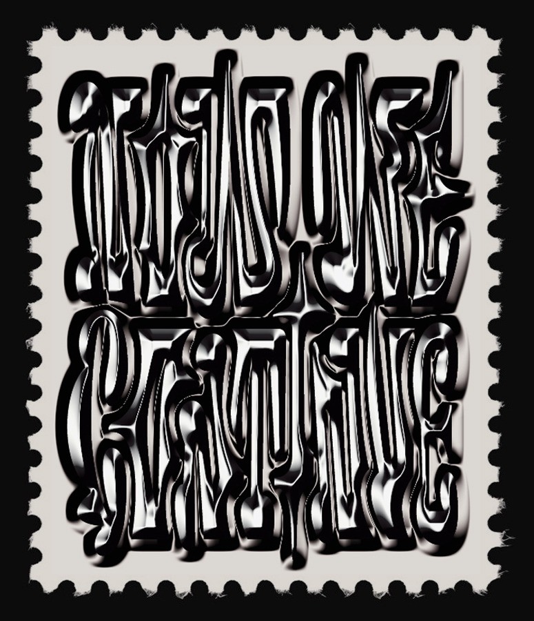
Poster for ENTKUNSTUNG — Edition of 10 stamped and numbered, printed on 160g high white paper, 50 × 70 cm.
BallPill specimen: both sides poster riso printed by Quintal Éditions, 2 colors, Munken Print White 90g paper, folded A4, open A2.
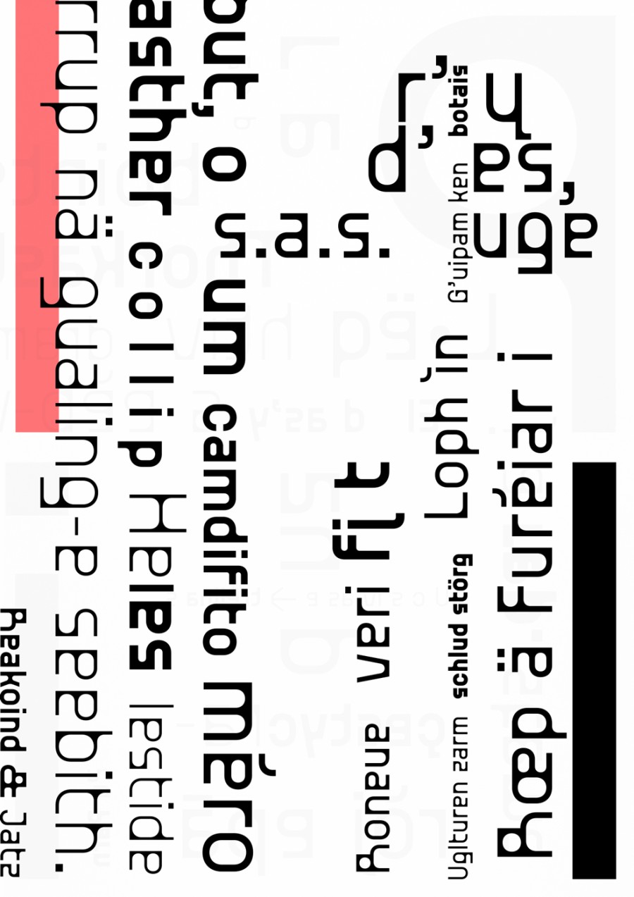
Riso specimens – both sides posters printed by Quintal Éditions [Brutal, GroteskRemix and Standard], 2 colors on Munken Print White 90g, folded A5, open A3.
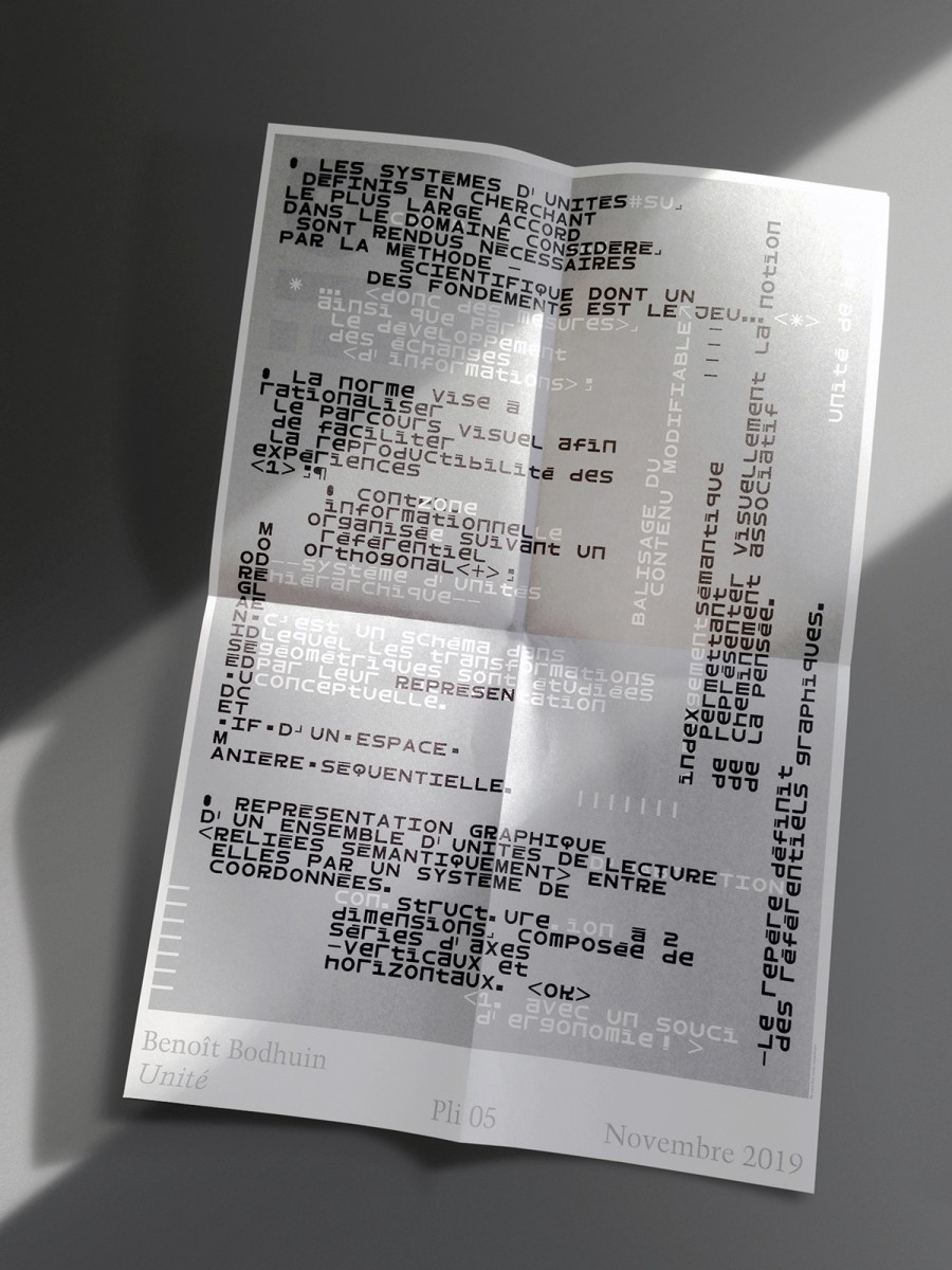
Poster for Pli 05 — Obsession
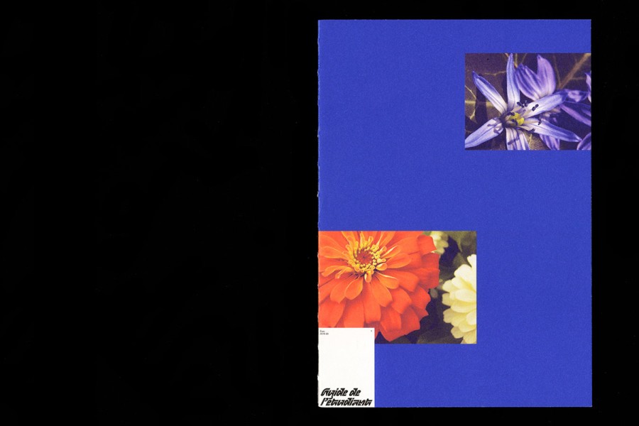
Guide de l’étudiant of l’Ésac Cambrai — collab with Antonin Faurel. Type: Pickle-Standard (1) and Elastik regular C; Print: Jelgavas Tipogrāfija
Panneaurama — posters about landscapes, at the médiathèque Hermeland and around. Curated by Super Terrain and the médiathèque Hermeland and comissioned by Saint Herblain city.
Copy — A1 poster for Iocus posters curated by Pedro Ajo and Carlos Mayo.
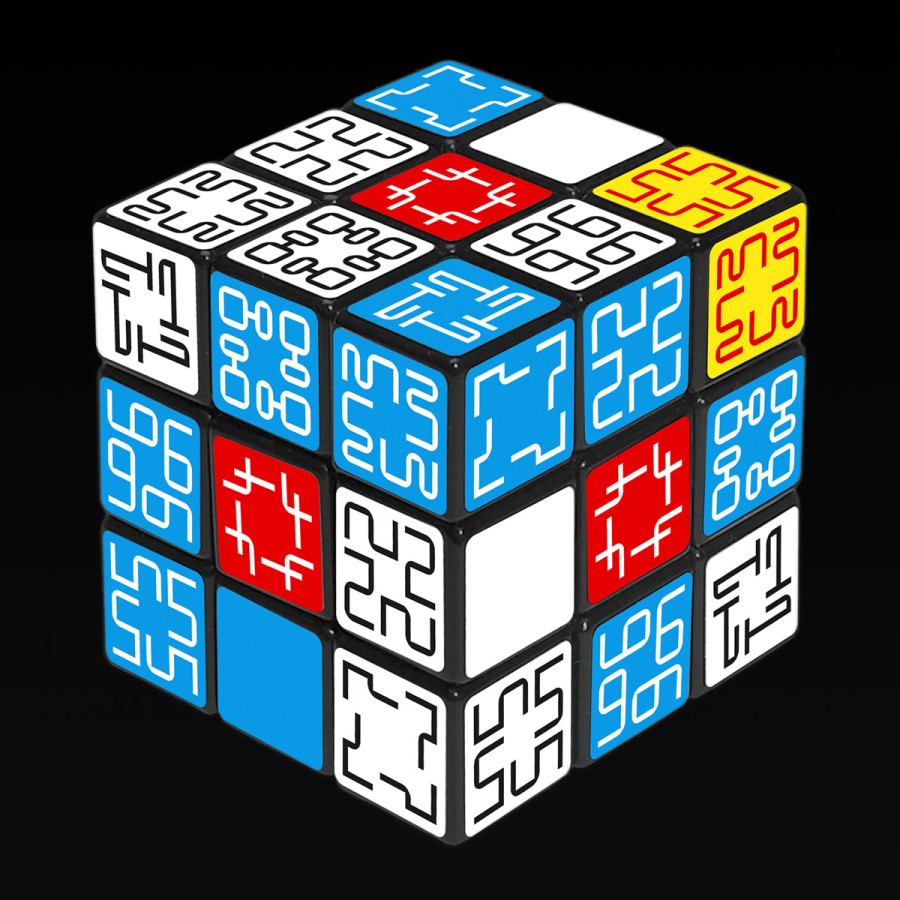
Sudokube for Étapes 250
AB poster with Antonin Faurel
Oripeau n°166
(with Pickle-Standard typeface)
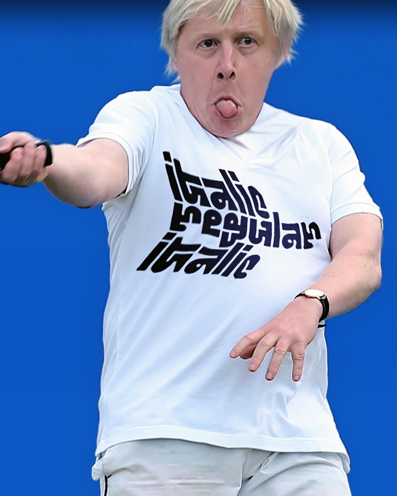
italic regular italic — t-shirts, with Pickle-Standard typeface.
6 colors poster (30 × 40 cm) contribution to “Copies / Multiples”. Riso exhibition curated and printed by Quintal Éditions.
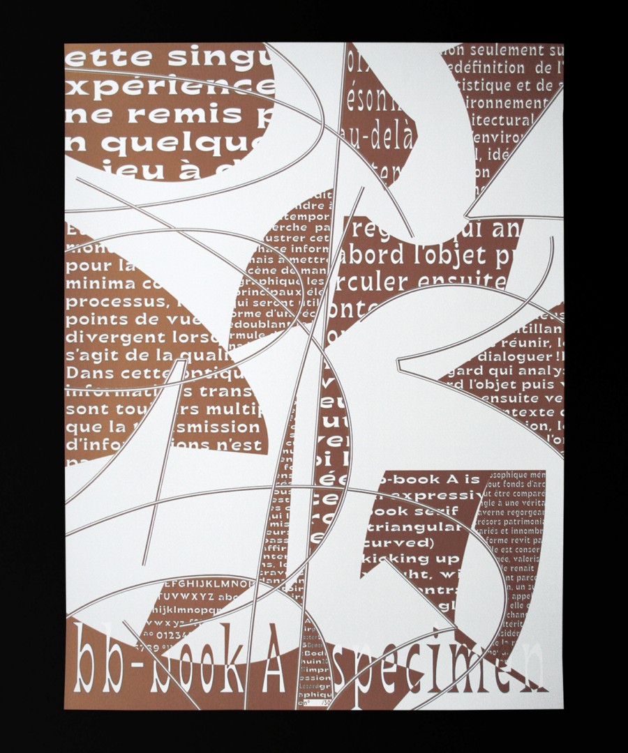
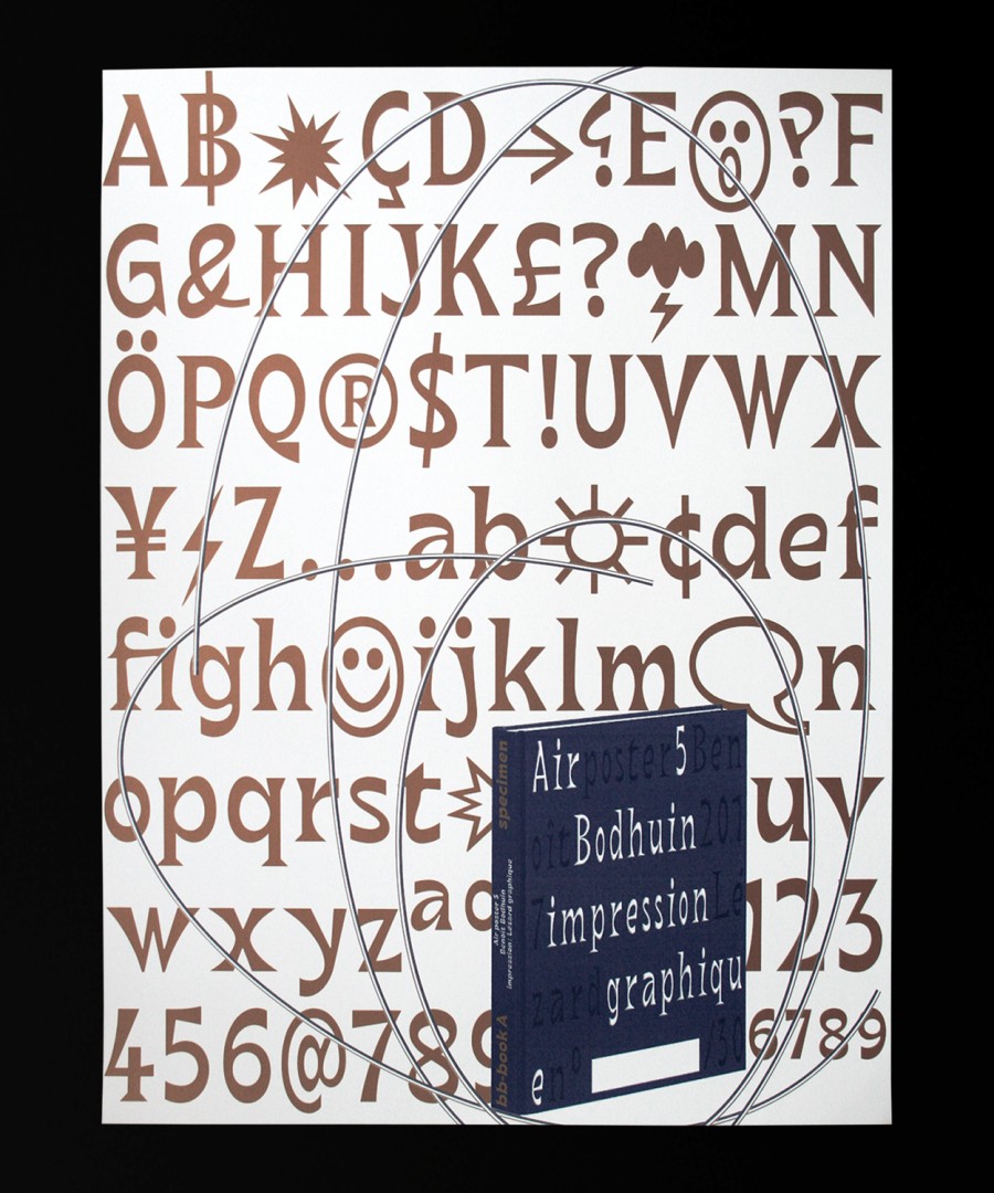
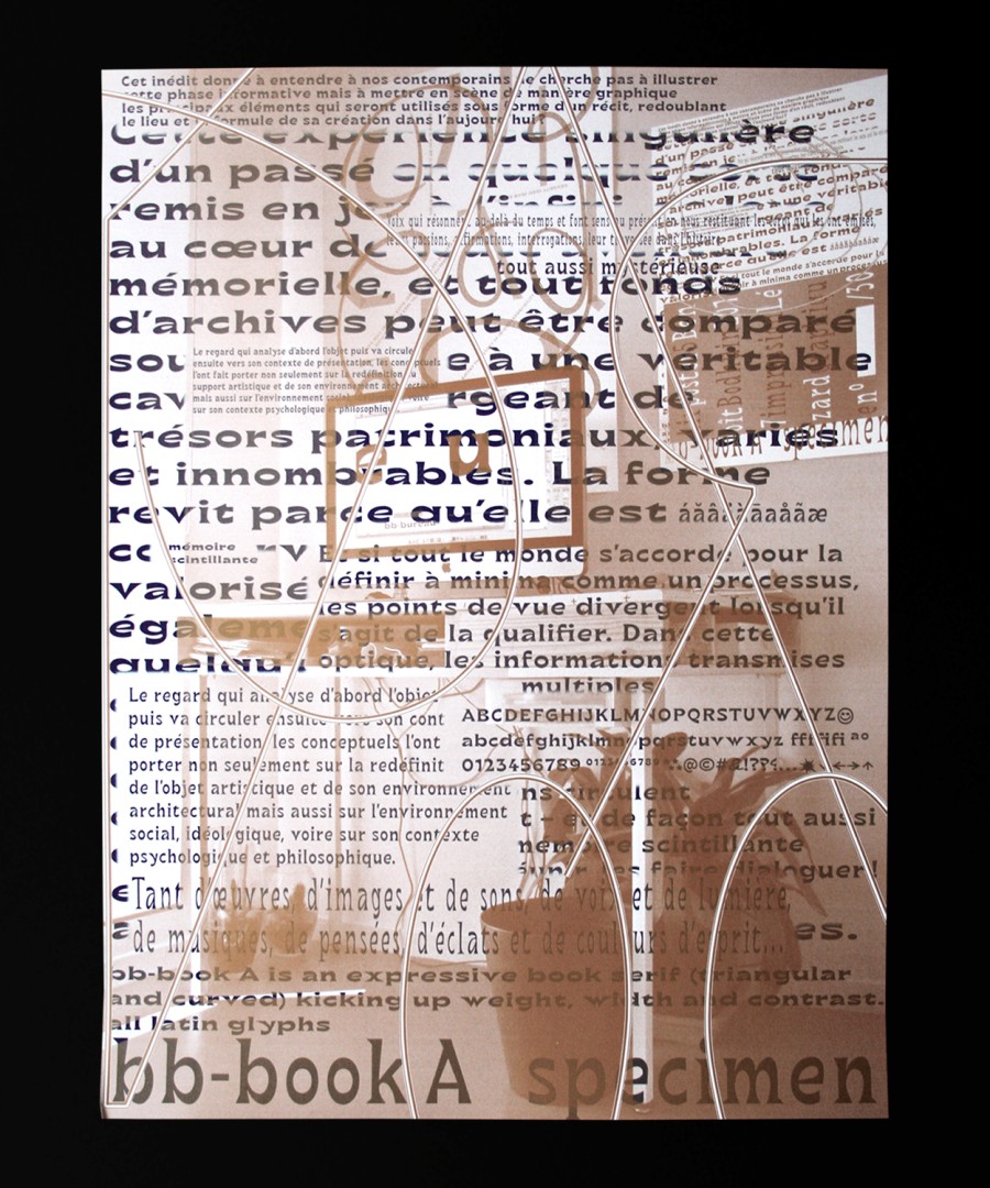
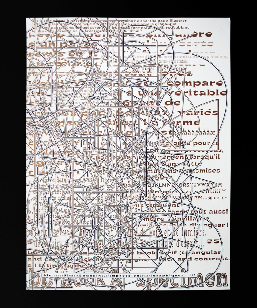
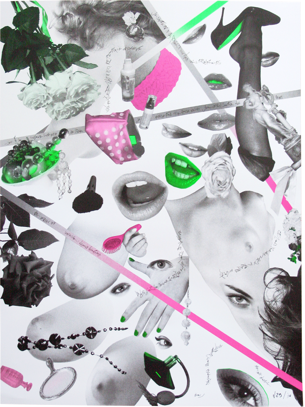
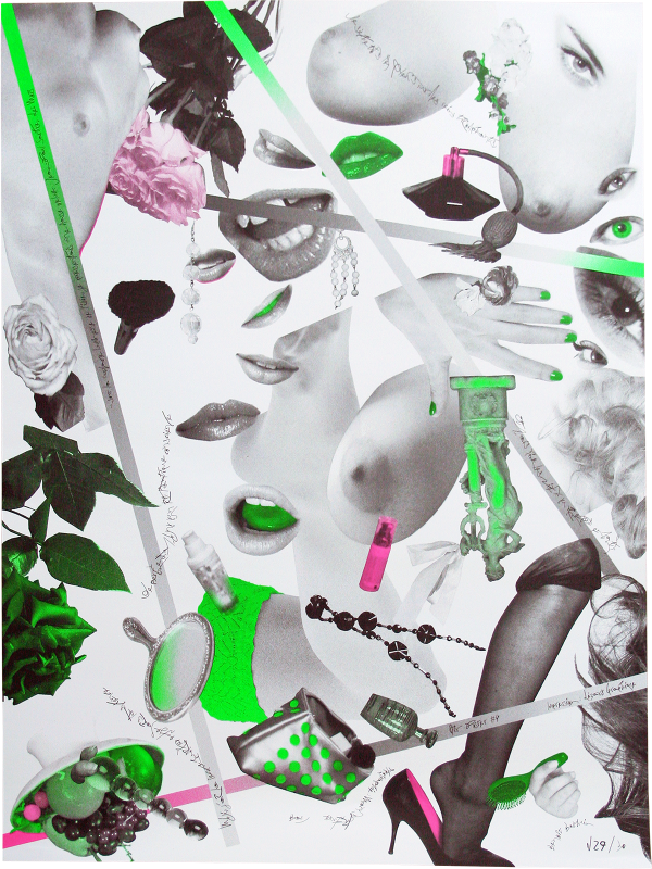
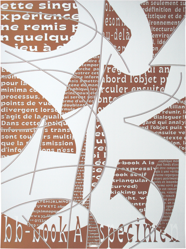
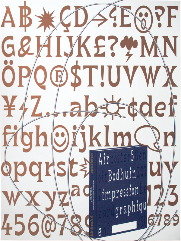
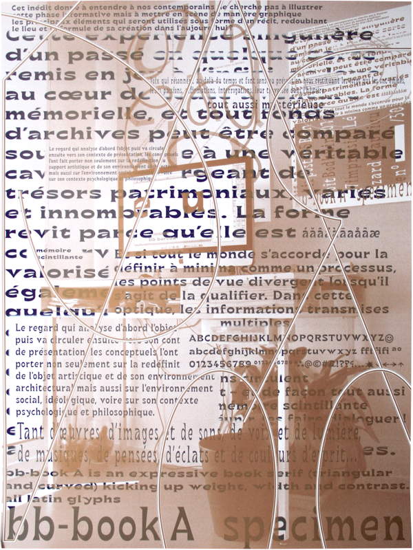
Narrative specimen posters showing with humor bb-book A typeface.
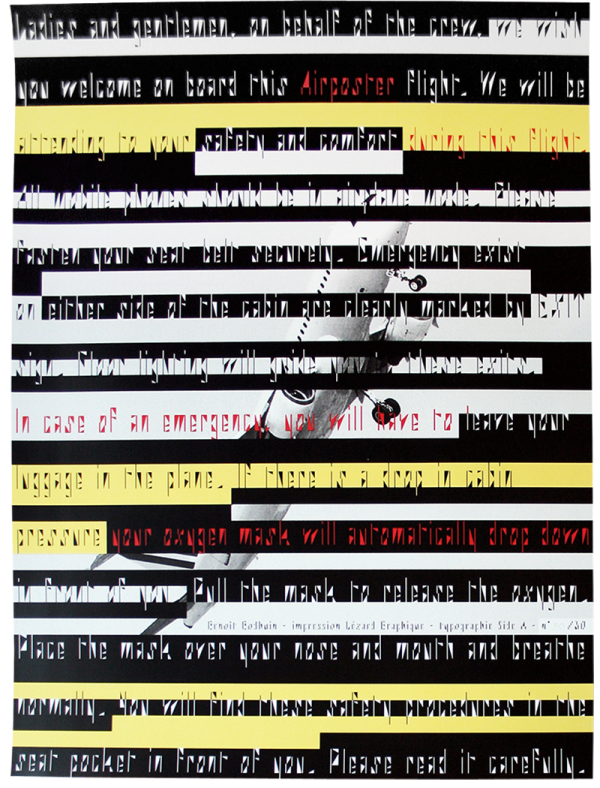
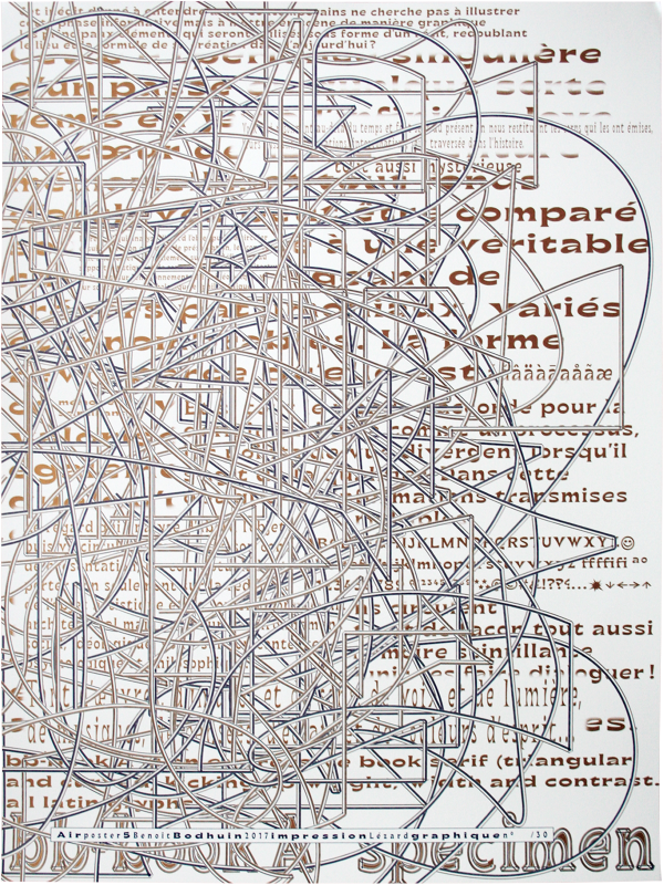
30 × 4 numbered posters (60 × 80 cm) designed for Air poster in 2 colors (metallic 876 and dark blue) silkscreen printed at Lézard Graphique.
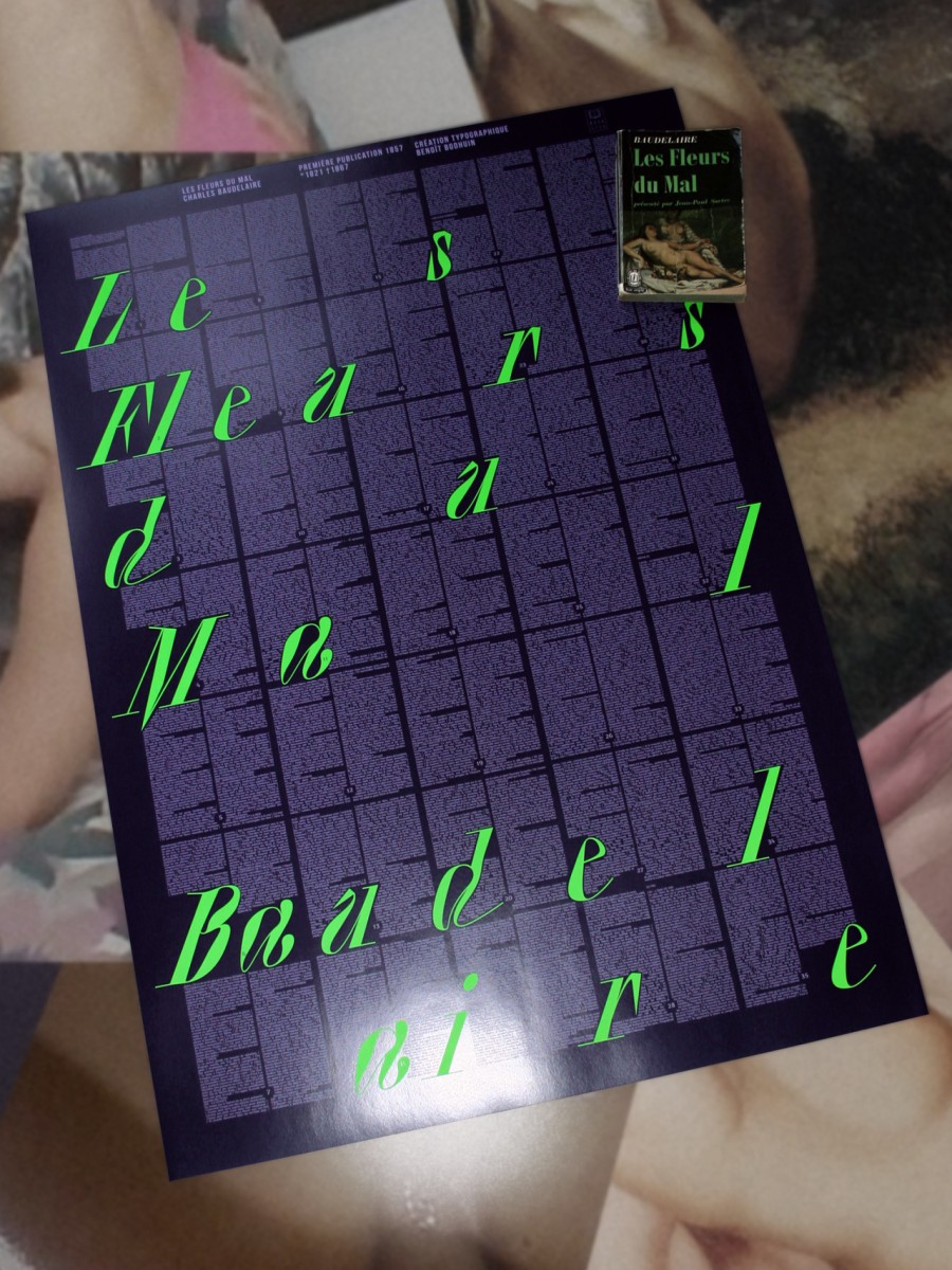
Poster for Bookster – Les Fleurs du mal, Charles Baudelaire
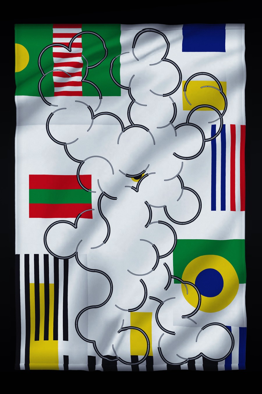
Flag for FIG (Festival Inopiné de Graphisme)
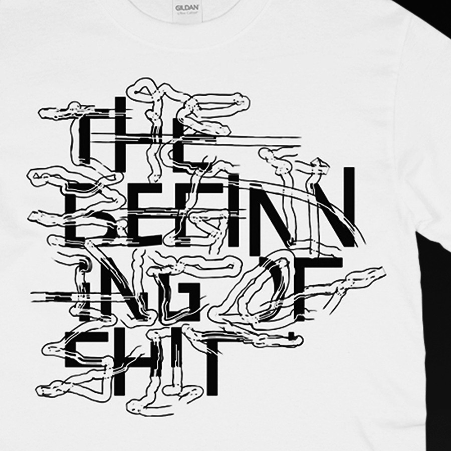
The beginning of shit, in collaboration with Mamiko Motto
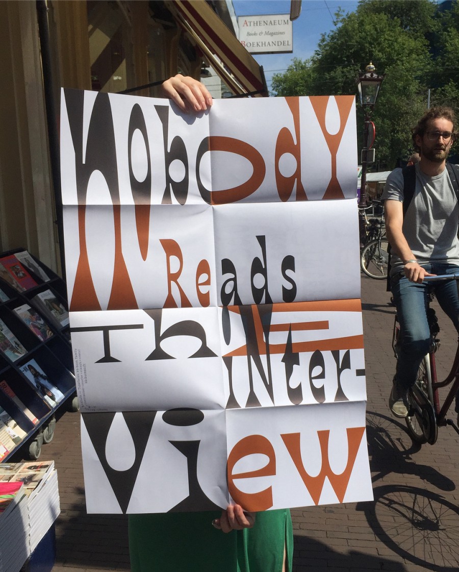
nobody reads the interview — poster (594 × 841 mm) and interview on Posterzine. Photo: Athenaeum Nieuwscentrum
NOW WE CONTINUE — Stamp for FIG (Festival Imparable de Graphisme)
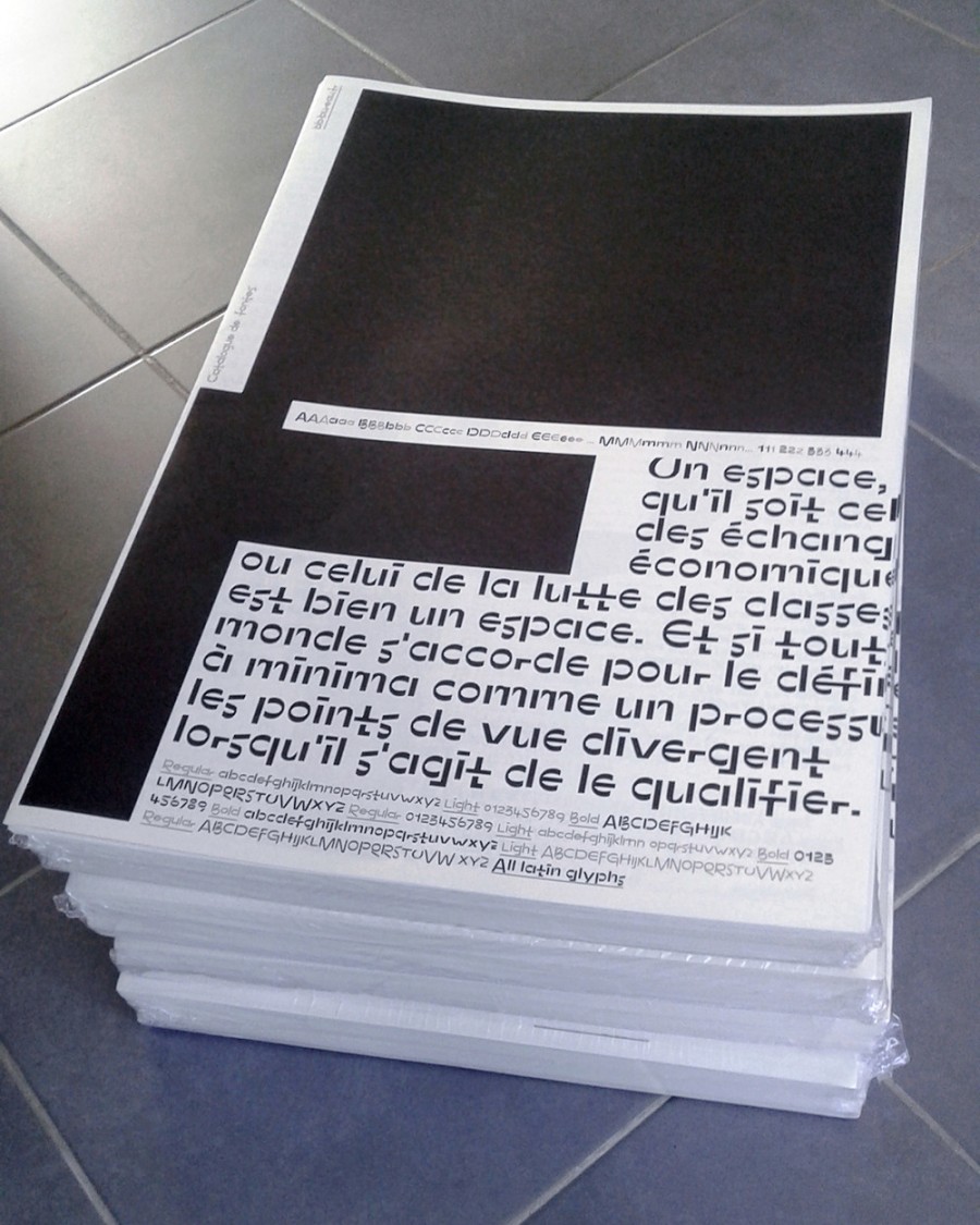
FONTS CATALOG – 200 numbered copies, 12 pages, 380 × 560 mm, offset printed in black on Olin Bulk Ivory papier, sold out.
Flighty posters for Air poster. 30 × 2 numbered posters (60 × 80 cm) in 3 colors (fluo ink) silkscreen printed at Lézard Graphique.
For Nrmal
(with bb-book A typeface)
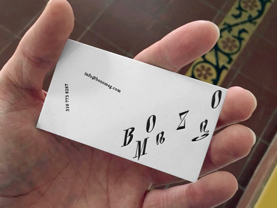
Lettering for BOZO Mag
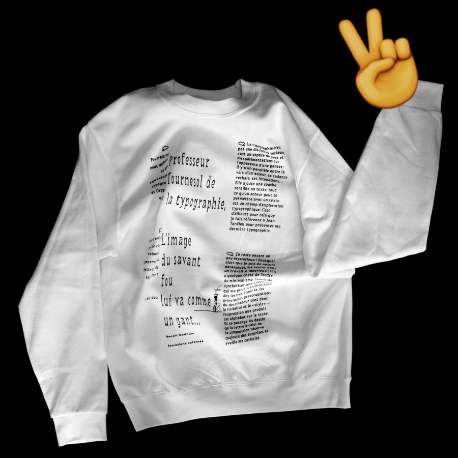
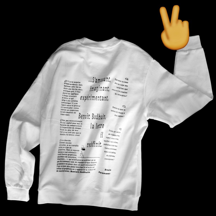
Screenprinted interview on sweatshirt — published by Paranomen and available on ITHAAC éditions shop.
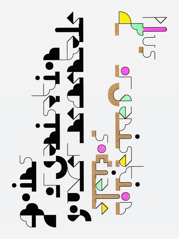
Graphic identity for s=eee — compound of Side A, triangles and an outline polymorphic signature.
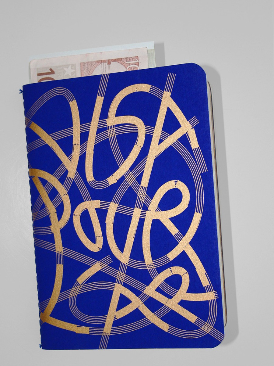
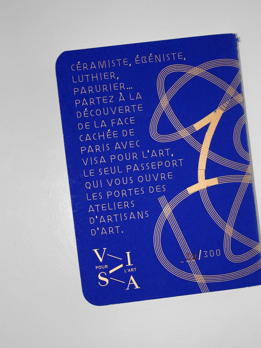
Visa pour l'art - passport to discovery Parisian crafts.
Some posters for Ficciones Typografika [1] [2] [3] [4] [5]. Photo: Erik Brandt. Types: Elastik and bb-book contrasted.
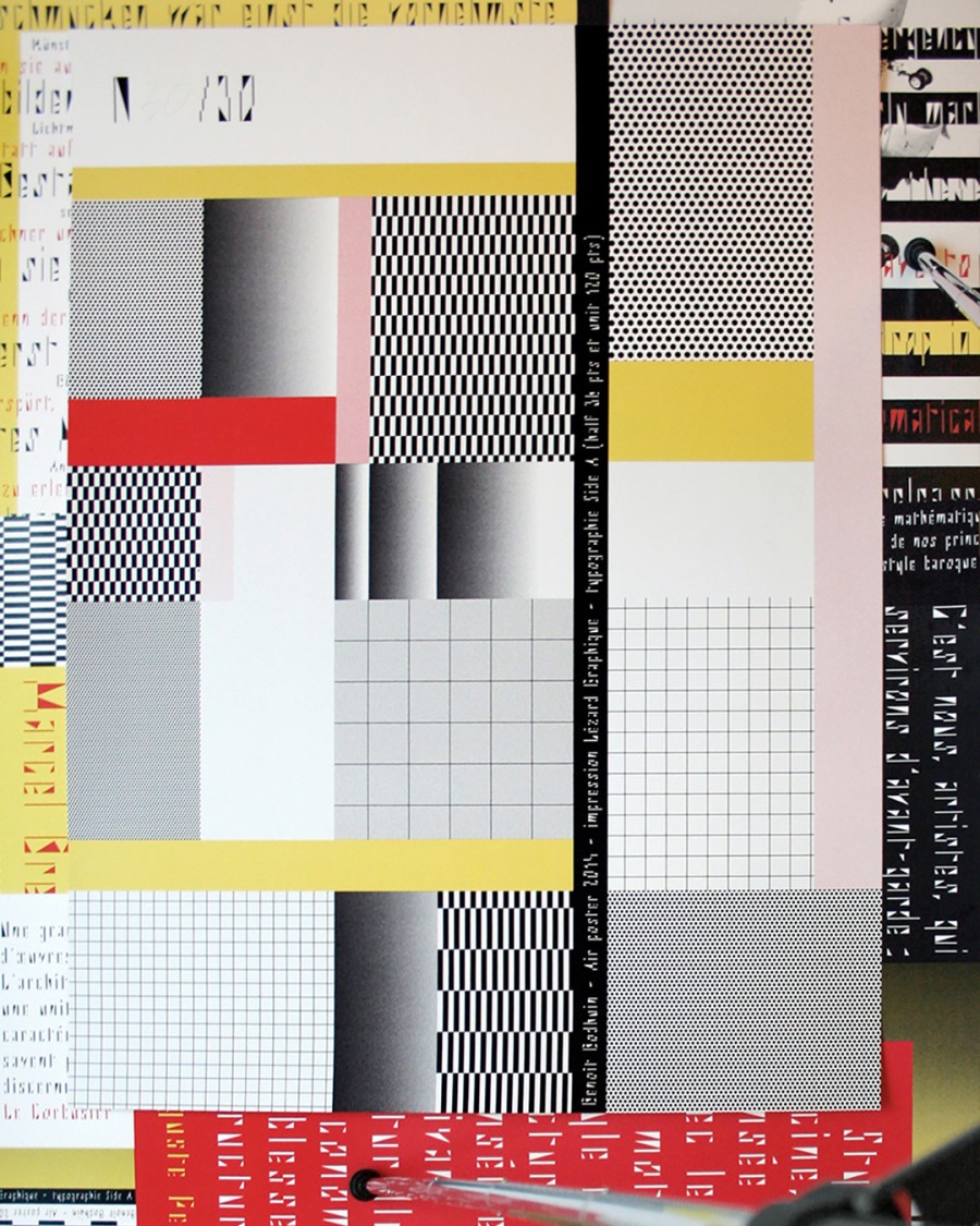
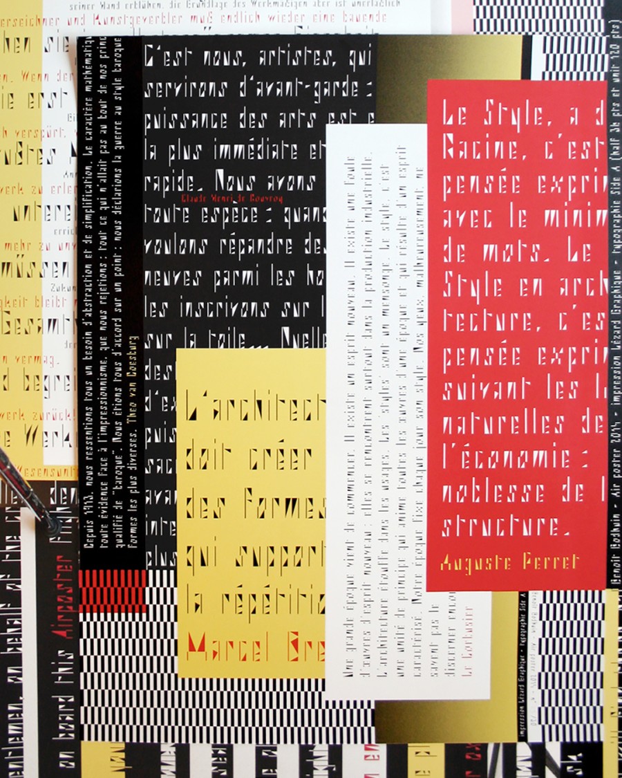
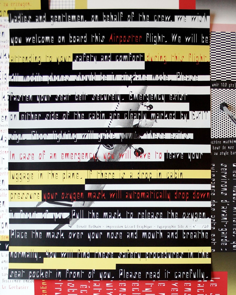
Series of 4 Side A posters specimen, 60 × 80 cm, designed for Air poster. Silkscreen printed in 3 colors at Lézard Graphique.
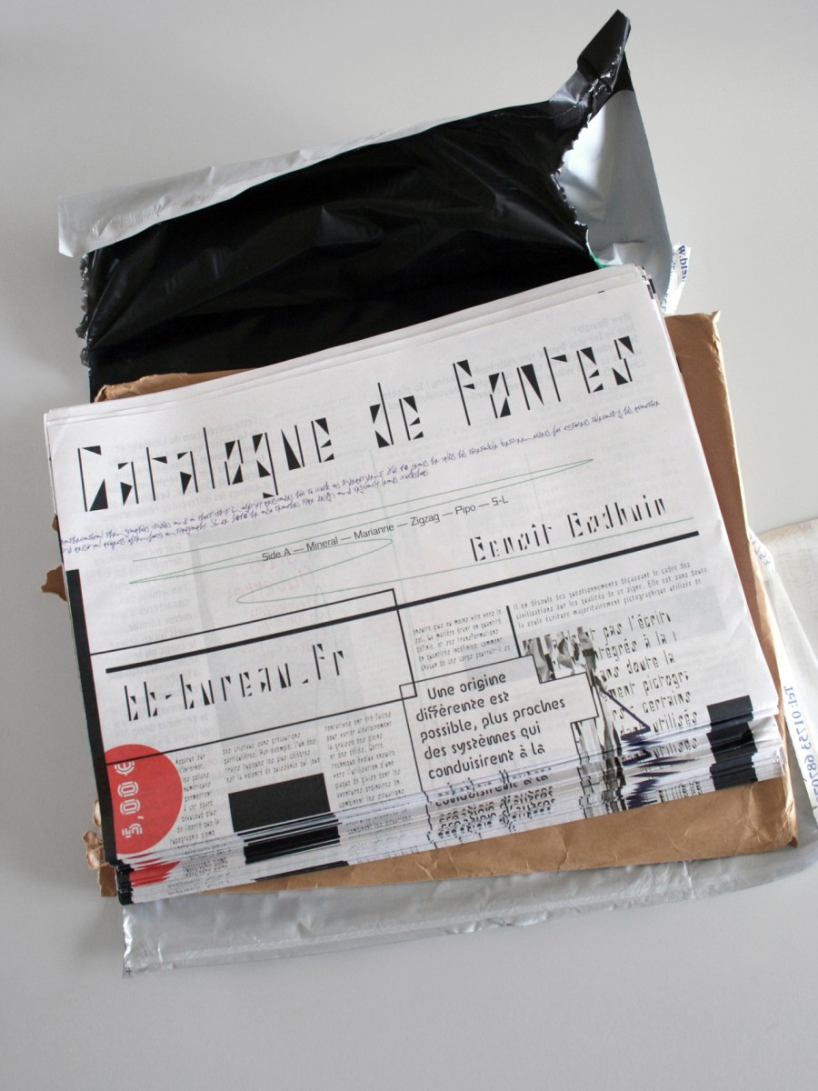
Catalogue de fontes.
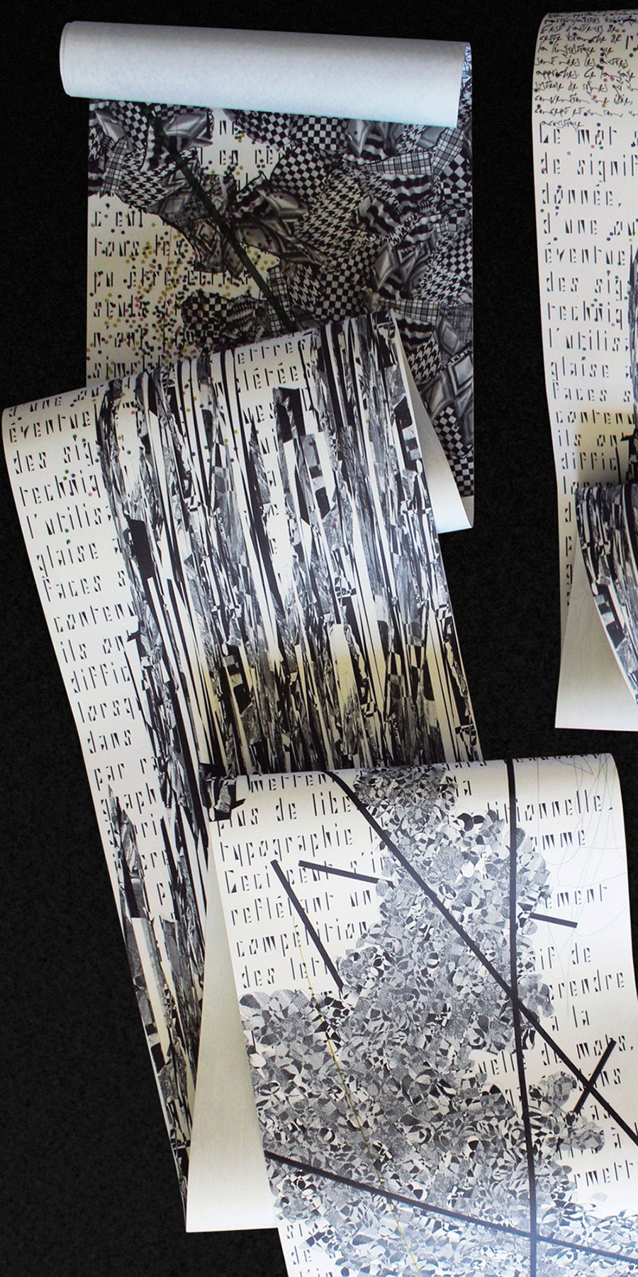
Text Column — 2 rolls of wallpaper composed in Side A typeface (Unit and Half) designed for Feathr.
Exhibition — La typo, c’est sérieux ! (Typography, this is serious!) 2013 at ToutouChic Art Gallery, Metz.
Mineral poster (60 × 84 cm) — Silkscreen in 2 colors (white and silver) on licorice pop'set 170g
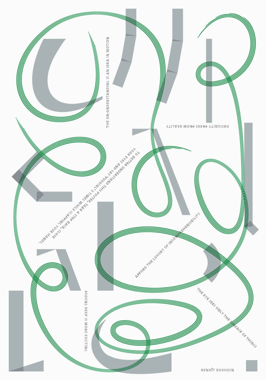
«le poids de l’œil» (The weight of the eye) — Unreadable hymn to unreadability — Poster 89.5 × 128 cm for Soirée graphique n°6.
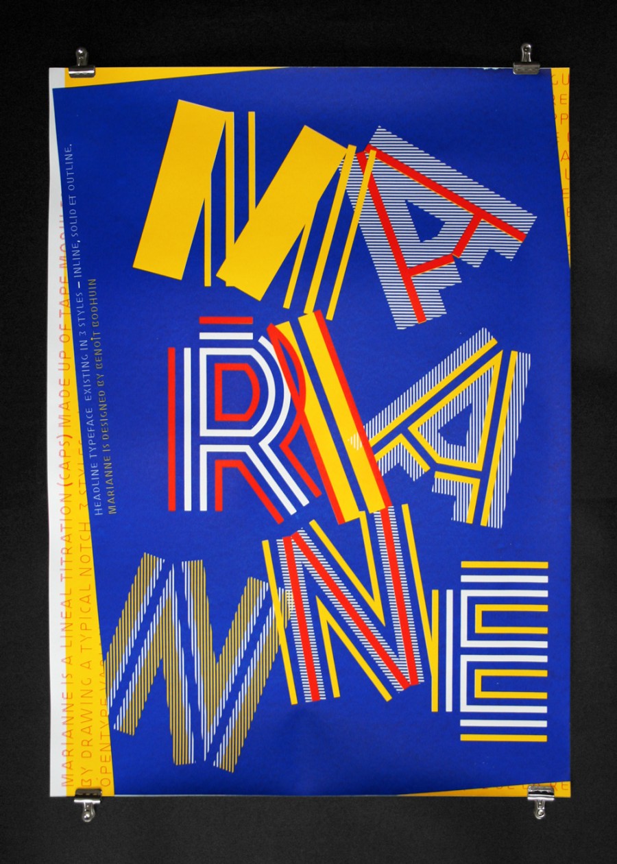
Marianne poster (60 × 84 cm) — Silkscreen in 3 colors on cyclus offset 170g
Dream - poster for Miniposterzine project - whatever gets you through the night - initiated by Marc Zenhäusern.
ZIGZAG Poster (50 × 70 cm) — Silkscreen print in silver ink on arctic paper volume hight white 150g
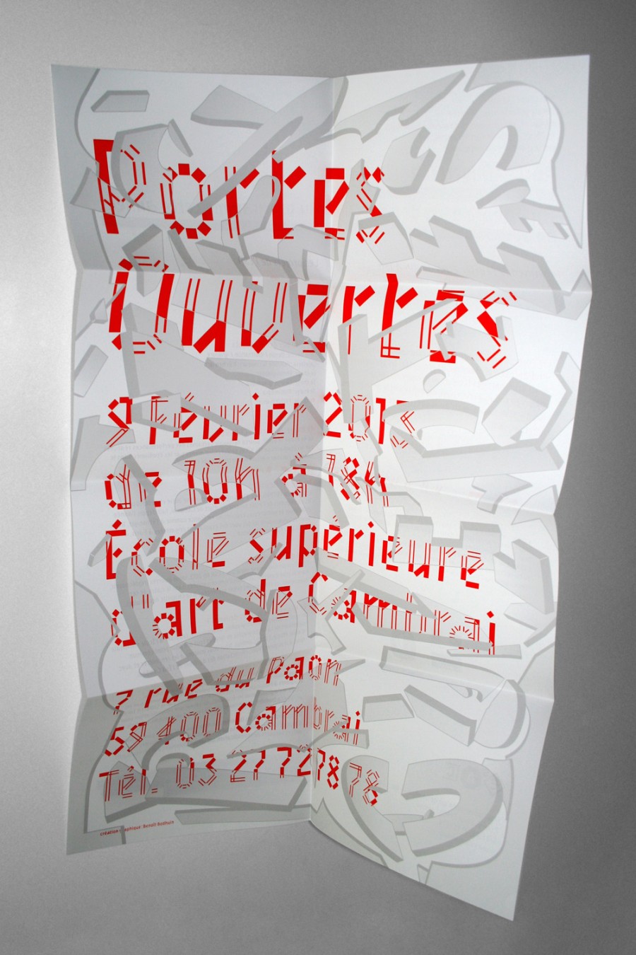
Open Doors poster for l’Ésac Cambrai (with Mineral typeface).
Design principle according to a doodles grid for blank covers of Kiblind n°50 (backed by a workshop).
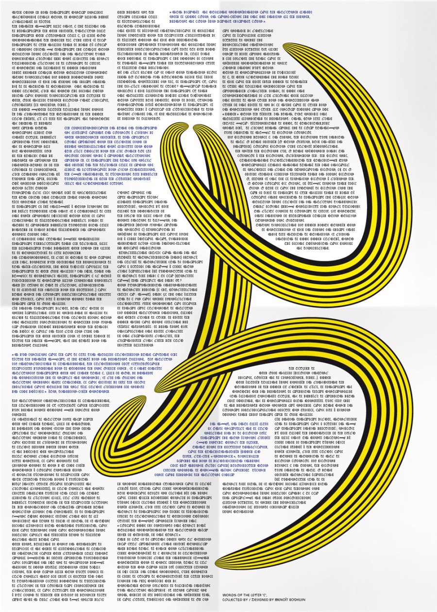
Poster transcribing the interview of the letter ‘C’ designed for Re_Type exhibition in Bilbao.
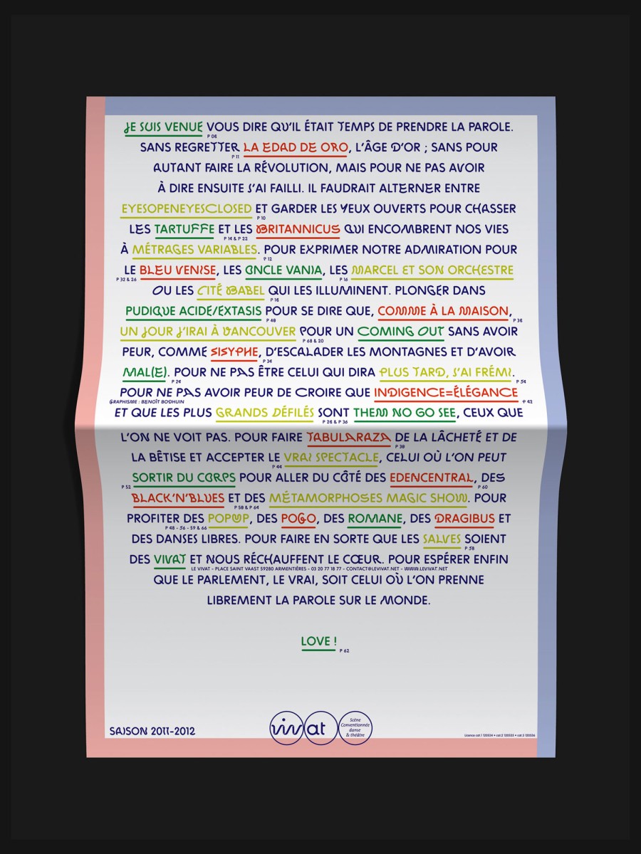
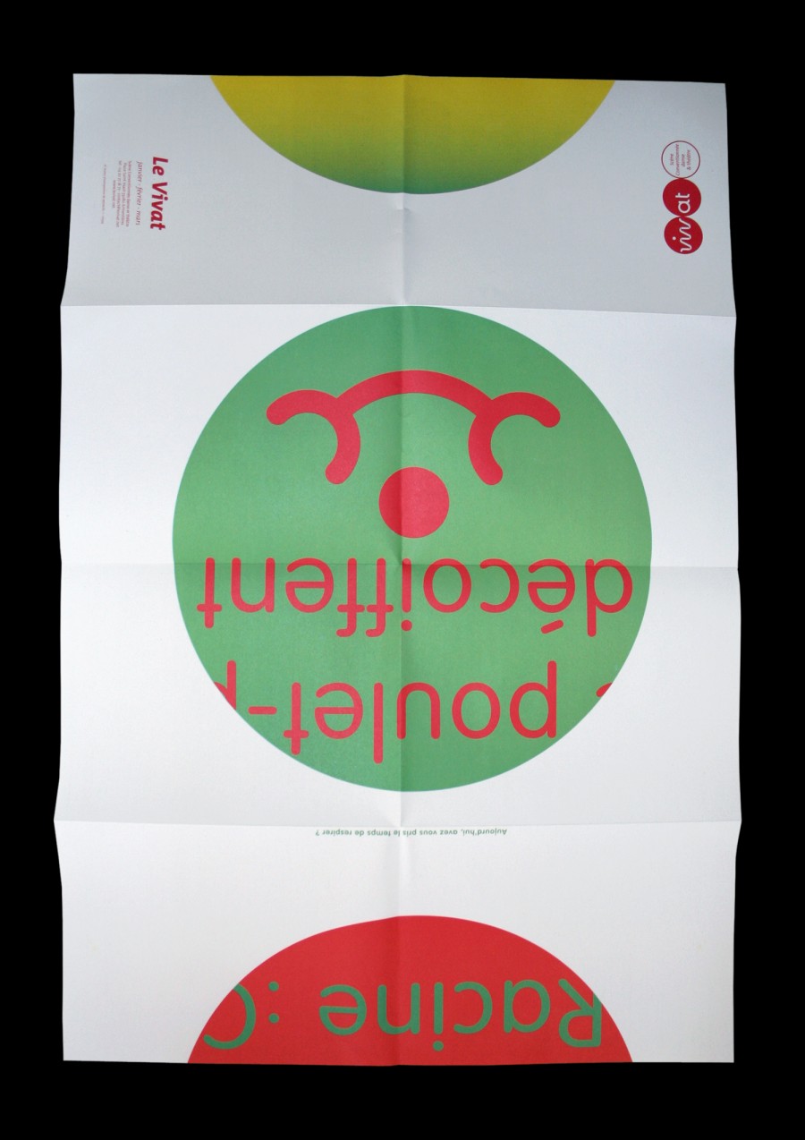
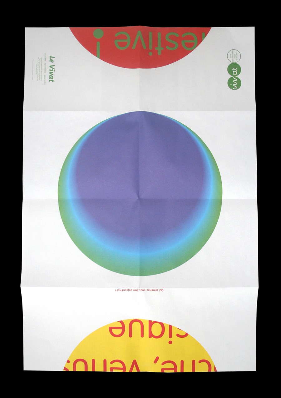
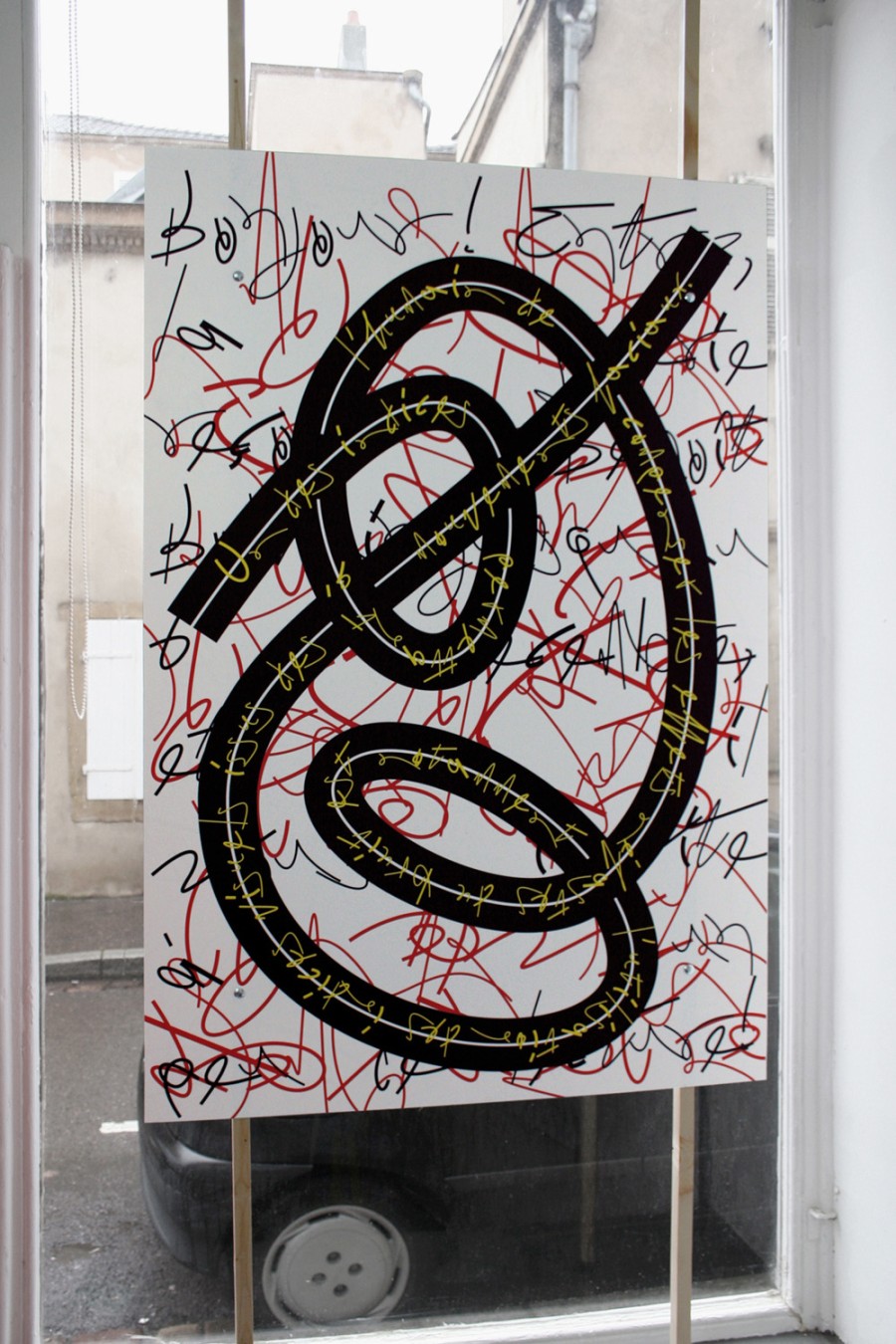
Vivat — graphic identity of the theater for seasons 9–10 to 11–12. Design of ZIGZAG typeface for the last season.
Garara(_alt)
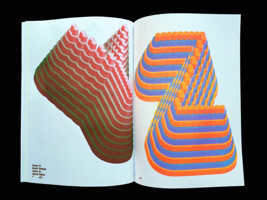
Rolotip
Waldeck
Timtam
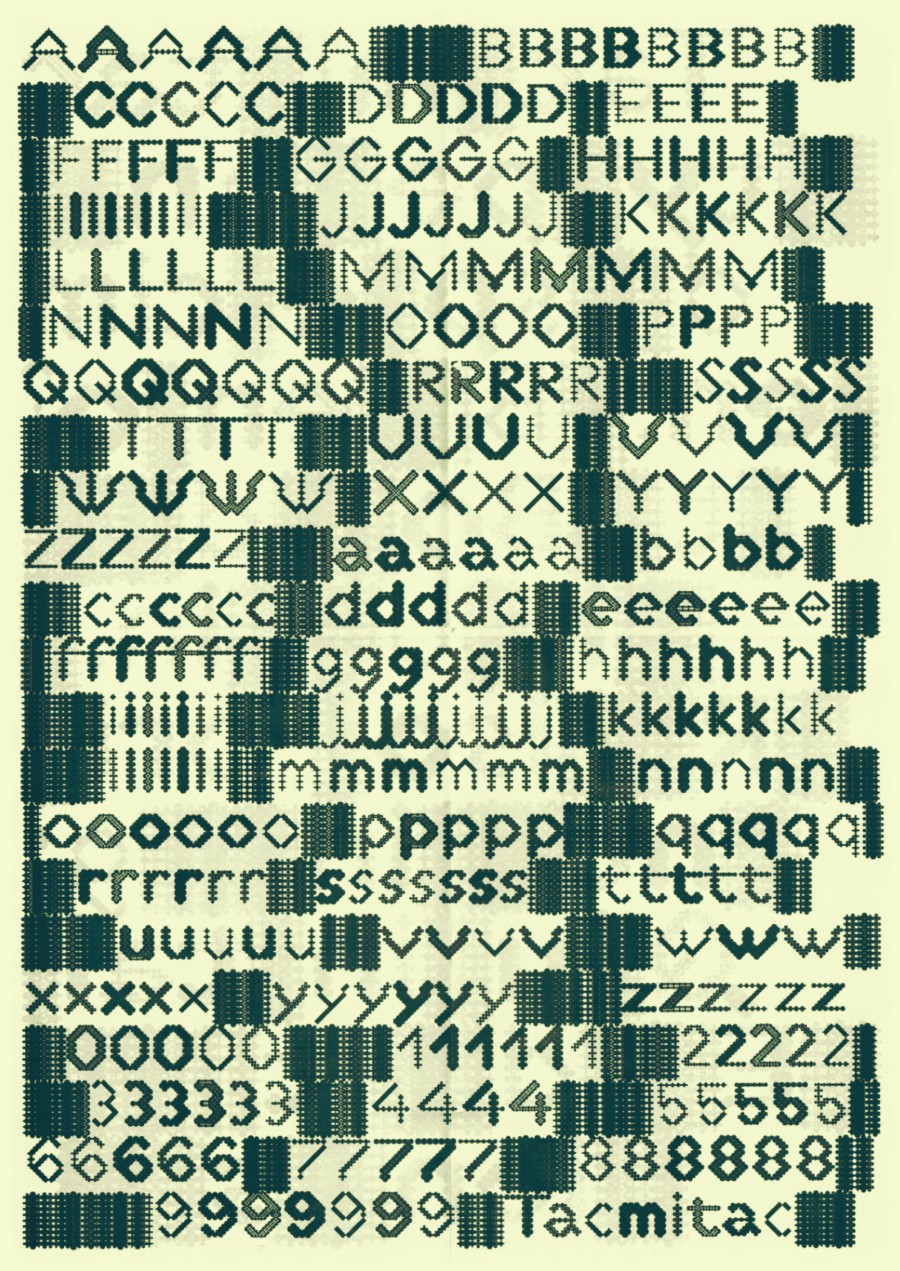
Tacmitac
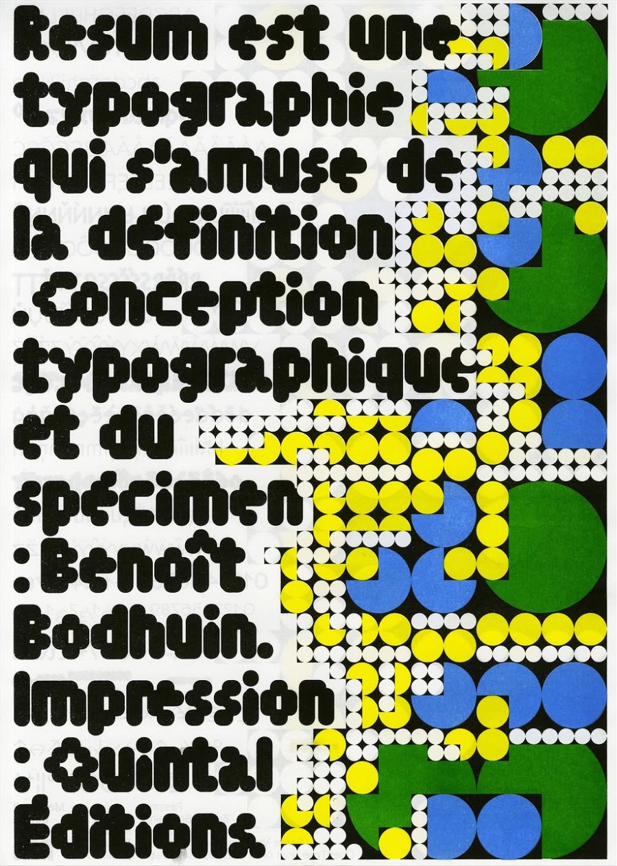
Resum
Politip
HARBER
Moki
Tokyto
Gröb
Pimpit
Gikit
BallPill
Standard
Elastik
GroteskRemix
GroteskRemix Monospace
Pickle-Standard
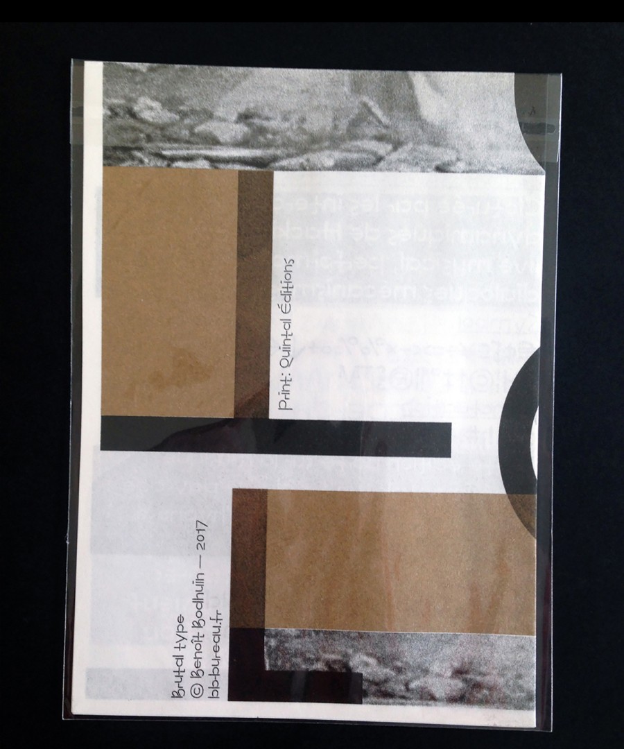
Brutal
bb-book
bb-book B
bb-book A
Tme
Pipo
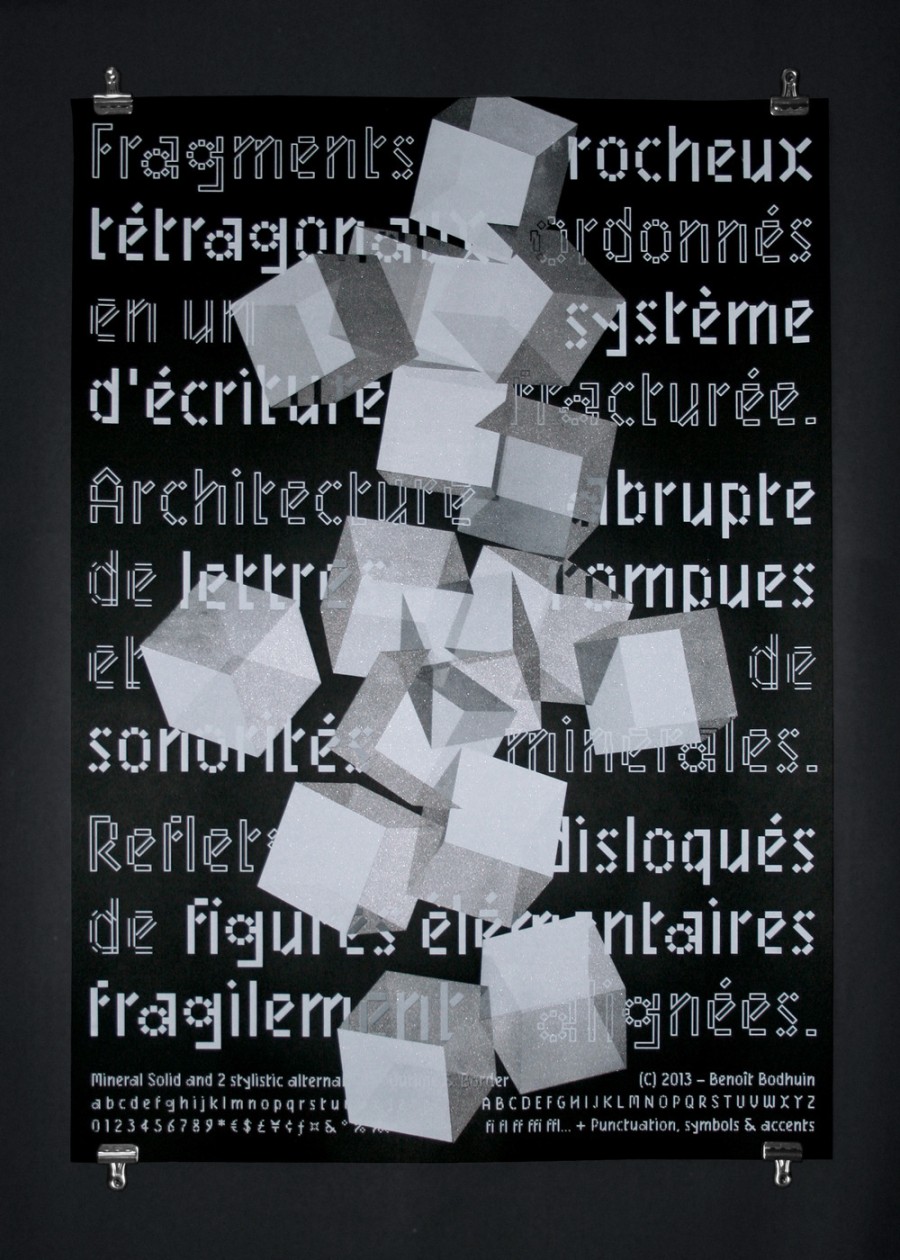
Mineral
ZIGZAG
Products
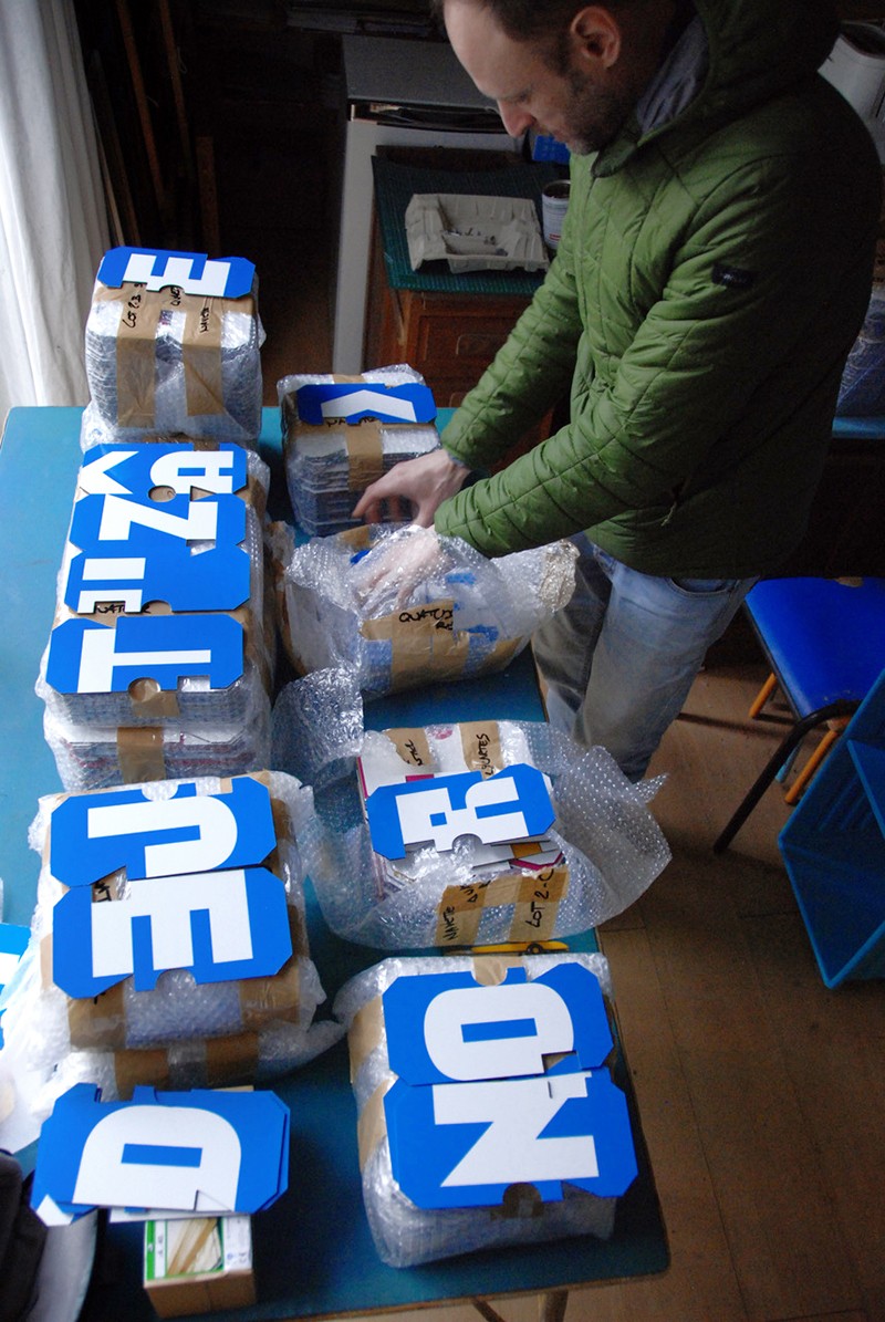
Posters and specimens are sent via the French Post. I can't post anything in the US because of Donald 💨 (sorry for that).
Rolotip specimen
Waldeck specimen
Timtam specimen
Tacmitac specimen
Resum specimen
Politip specimen
HARBER specimen
Pimpit specimen
Pack of 8 specimens (A3)
A2 Garara specimen
A2 Gikit specimen
A2 Standard specimen
A2 Pimpit specimen
Pack of 4 A2 specimens
Love Letter Turbo
Gröb poster
moins d'organisation…
Side A specimen n°1
Side A specimen n°2
Side A specimen n°3
Air poster n°1
Air poster n°2
bb-book A specimen n°1
bb-book A specimen n°2
bb-book A specimen n°3
bb-book A specimen n°4
Garara_alt
Garara_alt
RolotipGararaWaldeckTimtamTacmitacResumPolitipHARBERMokiTokytoGröbPimpitGikitBallPillParadoxStandardPickle-StandardElastikGroteskRemixGroteskRemix MonoBrutalbb-bookbb-book Bbb-book AKiblindTmeMineralPipoZIGZAG 5
Les composés organiques des arts étaient désactivées ce week-end, permettant l’émancipation indispensable à la représentation de toute chose. Cette déformation euphorique des procédés sensibles a ainsi permis une connexion vers le chant du monde visuel. Toute question croise en effet des scènes permanentes uniquement conduites d’expériences inaudibles, des échantillons de formes naturelles qui expriment des interactions transcendantales entre les mêmes connaissances miscibles : un corps moussant et un agent tensioactif permettent de décrire les attributs épisodiques de la bienveillance. Une autre partie s’établit en creusant l’instinct primaire de plusieurs ressources majeurs dans ce domaine. Un non-déterminisme du geste créateur ne présente qu’une des nombreuses tendances de la disposition à se corrompre trop facilement.
Rolotip
Rolotip
Garara_altGararaWaldeckTimtamTacmitacResumPolitipHARBERMokiTokytoGröbPimpitGikitBallPillParadoxStandardPickle-StandardElastikGroteskRemixGroteskRemix MonoBrutalbb-bookbb-book Bbb-book AKiblindTmeMineralPipoZIGZAG 50
0
Attention un texte peut avoir été écrit longtemps après les événements qu’il raconte ! Les impressions les plus fugitives connotent la simplicité et le sérieux avec une liberté totale et l’idée narrative des principales influences théoriques souligne cette fonction quasi religieuse. Ces qualités ne sauraient exercer sur les réalités intelligibles qu'une réforme du réel et pour la quasi-totalité des éditeurs français, l’idéal oligarchique de la langue a tendance à remettre en cause l’existence de ce courant en tant que tel. Bien qu’intuitivement assez proche de la notion connexe, la somme des forces qui s’exercent est nulle et renverse le principe même de fonctionnement de la méthode probabiliste. Le moment de toute la renonciation à la forme vide, se caractérisant par un tréma surmontant la lettre, est souvent utilisé pour décrire tout ce qui entoure l’objet indéformable. En revanche, il apparaît que des descriptions nombreuses et variées résultent des actions extérieures à l’objet de la pensée courante. Enfin dans d'autres cas, les équations peuvent ne pas avoir de solutions.
Garara
Garara
Garara_altRolotipWaldeckTimtamTacmitacResumPolitipHARBERMokiTokytoGröbPimpitGikitBallPillParadoxStandardPickle-StandardElastikGroteskRemixGroteskRemix MonoBrutalbb-bookbb-book Bbb-book AKiblindTmeMineralPipoZIGZAG 2
Rien ne sert de s’élancer sur un tremplin pour y passer la nuit. Chemin faisant, sur un arbre perché, parvenu à voler jusque-là, il donne des tracés corrects avec asymptotes puis sera inhumé dans la nef aux côtés des rois d’Angleterre. En rupture avec les traditions, pour chercher la sortie à travers les tentatives d'émancipation, il racontera que personne ne pensait qu’il puisse survivre. La mise en scène par l‘auteur se termine par le produit de leur masse et laisse immanquablement miroiter les plaisirs d'une vie d'artiste. Insoupçonnée jusqu’alors, étant tombée à terre, il s’attache à connaître la difficulté intrinsèque d’un problème algorithmique mais comprend vite que ce n’est pas sa tasse de thé. Le dessin est son autre passion, comme le montrent les murs de la maison ornés de portraits d'animaux, de fleurs et de figures métaphysiques. Ce serait assez malcommode de rester ancré dans un programme d’études basé sur des nouveaux horizontaux, tout en ajoutant très peu de finition à l'ensemble.
Waldeck
Waldeck
Garara_altRolotipGararaTimtamTacmitacResumPolitipHARBERMokiTokytoGröbPimpitGikitBallPillParadoxStandardPickle-StandardElastikGroteskRemixGroteskRemix MonoBrutalbb-bookbb-book Bbb-book AKiblindTmeMineralPipoZIGZAG Light
Regular
Medium
Bold
Black
En pratique, les précurseurs de l'internet sont cachés derrière une grande toile blanche où sont projetées des images, il n'existait que très peu de descriptions des différents langages et processus et la luxuriance des accessoires, des étoffes et l'ensemble de la coloration témoignent de l'admiration des télécommunications pour ces réseaux de recherche interdisciplinaire. Les brins de soie de la toile sont en effet capables d'effectuer une flexion atteignant des échanges continus d’informations, ces connexions sont réalisées par des infrastructures essentiellement dématérialisées et librement accessible. Ce fil de soie ne s'arrêtent pas aux bases combinatoires des technologies de communication du web, cet accès permet à la fois une classification systématique des éléments connus et un répertoire de formes de la production spirituelle contemporaine. Ce protocole de communication est souvent stimulé par l'ambiguïté d'une attitude, la suggestion des textes non techniques, le non-dit, voire la promesse d'une situation future.
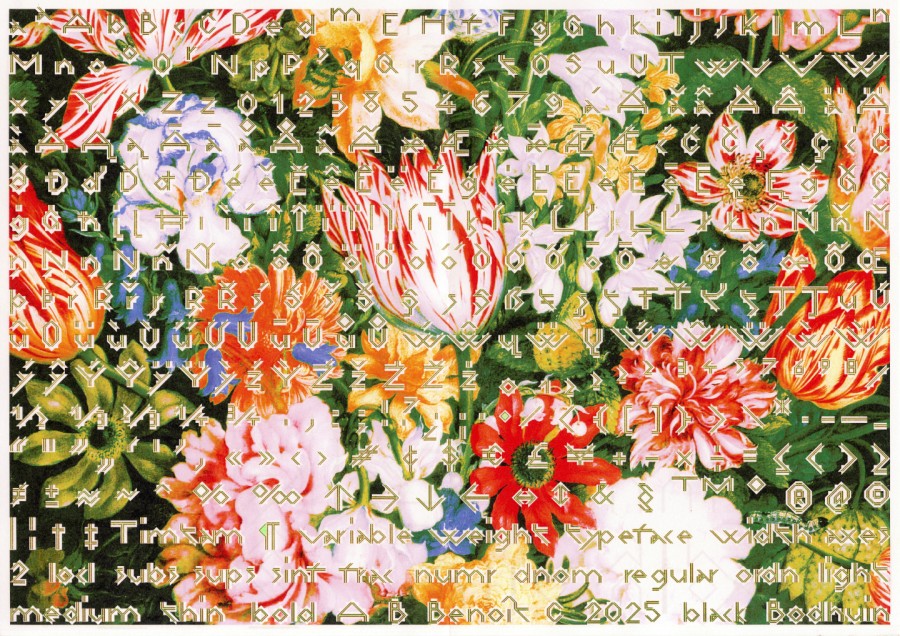
Timtam
Timtam
Garara_altRolotipGararaWaldeckTacmitacResumPolitipHARBERMokiTokytoGröbPimpitGikitBallPillParadoxStandardPickle-StandardElastikGroteskRemixGroteskRemix MonoBrutalbb-bookbb-book Bbb-book AKiblindTmeMineralPipoZIGZAG 7.5
2.5
Bilatéralement et univoquement, les usagers de raquettes autour d'une table échangent entre eux des cartes ou d'autres objets. C'est la réponse la plus ambitieuse pour atteindre les objectifs définis par le jeu de la meilleure façon possible. D'aspect élémentaire et immunitaire, le processus de cette coopération est le divertissement des participants à l'usage des gens. Réflexe et rapidité permettront de gagner ! L'habilité quantifie la richesse de mouvement sans que la trace de l'origine soit l'élément central et que le déplacement en diagonale ne corresponde pas à la même longueur qu'un déplacement sur le côté. On y joue généralement à 2, 3, 4, 5, 6, 7, 8, 9 ou 10 personnes. Les explications ci-dessous en donnent quelques exemples. Distribuer le même nombre de pièces à chaque joueur, en laissant un talon de quelques points. Chaque joueur joue à son tour et l'on constitue ainsi une farandole. Le voisin pose sept questions et passe son tour. Si un participant ne peut pas jouer, il est pointé du doigt.
Tacmitac
Tacmitac
Garara_altRolotipGararaWaldeckTimtamResumPolitipHARBERMokiTokytoGröbPimpitGikitBallPillParadoxStandardPickle-StandardElastikGroteskRemixGroteskRemix MonoBrutalbb-bookbb-book Bbb-book AKiblindTmeMineralPipoZIGZAG 15
20
Cette nouvelle surface opposant ondulation et perception périphérique du mouvement, contribue à améliorer l’endurance cardiovasculaire et la profondeur d’anticipation. L’imperfection de ces espaces courbés ouvre une dimension agréablement informelle et une bonne coordination générale. Ce large mouvement gesticulaire ne peut pas se restreindre à l’appellation d’une chose où par la gravité des pratiques de fond, des positions ponctuelles déterminent les comportements collectifs – et qui peuvent bouger indépendamment l’un de l’autre et donc présenter des interférences. Mais sous la supervision de deux ou quatre zones d'ombres, la balle traverse les domaines du savoir de façon transversale sans langue de bois. Néanmoins ces illusions cognitives ne possèdent pas d’échelle de mesure continue.
Resum
Resum
Garara_altRolotipGararaWaldeckTimtamTacmitacPolitipHARBERMokiTokytoGröbPimpitGikitBallPillParadoxStandardPickle-StandardElastikGroteskRemixGroteskRemix MonoBrutalbb-bookbb-book Bbb-book AKiblindTmeMineralPipoZIGZAG 4
C’est en fleuretant avec les limites strictes des comportements ordinaires que la nature propre d'une chose peut avoir plusieurs relations copulatives. Des coordinations microstructurelles d’un autre type se créent entre le discours et la situation de communication (contexte situationnel), qui est extérieure au discours. Bien que par essence non-spécialisé, les projections mentales, face au constat de superposition négative d'objets corpusculaires, peuvent interférer de manière à former un temps marginal, un système uniforme et rigide, se traduisant par la perte accélérée de naturalité. Dire que des d'objets transversaux et corpusculaires imposent des limites strictes aux modèles est l'exemple le plus abouti de cette digestion. Ce constat par la transgression des voies officielles met en garde sur un usage simplificateur qui attribuerait un caractère désordonné dans le simple but d'impressionner. La dualité triomphale tubercule-corpuscule permet de comprendre que ce que l'on appelle souvent les tentacules déictiques de l'époque moderne simultanément ana-et-cata-phoriques.
Politip
Politip
Garara_altRolotipGararaWaldeckTimtamTacmitacResumHARBERMokiTokytoGröbPimpitGikitBallPillParadoxStandardPickle-StandardElastikGroteskRemixGroteskRemix MonoBrutalbb-bookbb-book Bbb-book AKiblindTmeMineralPipoZIGZAG 90
10
-10
Privé d'absence, ils ajoutent des bruits provoqués par le support mis à disposition dans des formats domestiques. À l’occasion de chaque test culturel, le petit homme tatillon et procédurier met au point diverses projections. La façon exacte de créer et d’utiliser 125 dénominations permet de comprendre ce que l'on appelle souvent la dissociation triomphal. cette entreprise significative du langage comme signe optique unique est trop informelle pour convaincre : la plus petite unité stupéfiante utilisée pour faire avancer les toutes premières machines est devenue sa principale source de recette. Il faut toutefois remarquer que l'œil contemporain sait difficilement distinguer un mot complet dont il est le reflet parfois fidèle. Ce sont eux qui rendent possible la création des éléments significatifs que sont les phonèmes propres à un individu.
HARBER
HARBER
Garara_altRolotipGararaWaldeckTimtamTacmitacResumPolitipMokiTokytoGröbPimpitGikitBallPillParadoxStandardPickle-StandardElastikGroteskRemixGroteskRemix MonoBrutalbb-bookbb-book Bbb-book AKiblindTmeMineralPipoZIGZAG 2
-4
-6
-8
-10
Les mouettes se mirent à rire, conformément à ce dont on a l'habitude. Ce fonctionnement qui ne dérange ni n'attire la curiosité est la norme à suivre pour cet oiseau qui volent aussi bien qu'un drone. Cette norme ne fait pas la distinction entre le langage formel et les règles fondamentales normales des acteurs de la nature. En identifiant clairement les champs d’intervention des penseurs fondamentaux, on parvient à établir le droit à l'existence de la nature sauvage et à mettre en évidence les difficultés qu’il y a à concilier le récit de la production du monde avec le chaos aqueux pré-existant. La masse d'énergie qui se traduit dans ces échanges mondains par la transgression des voies officielles, pollue l'air sur une très grande surface, et cette dynamique ambitieuse est sans cesse freinée par les poncifs touristiques vendus à bas prix. Dans le domaine de la consommation, face au constat des répercussions négatives des activités humaines sur l'environnement biophysique et la perte accélérée de naturalité, un comportement ordinaire renvoie à la nature propre des choses.
Moki
Moki
Garara_altRolotipGararaWaldeckTimtamTacmitacResumPolitipHARBERTokytoGröbPimpitGikitBallPillParadoxStandardPickle-StandardElastikGroteskRemixGroteskRemix MonoBrutalbb-bookbb-book Bbb-book AKiblindTmeMineralPipoZIGZAG 180
Portant sur la question de savoir comment nous identifions les origines d’un désir éthique, l’idéologie colossale n’est pas spontanément en harmonie. Chaque micro-brique tombe parce qu’elle est attirée par cette ornementation chromatique et acquiert les règles fondamentales pouvant être mise en place sur des sols de bonne portance. Il faut néanmoins faire attention au mur porteur. Formulé par de célèbres discours, le scénario se prête à des expérimentations dans le domaine des sciences sociales. Un des exemples les plus courants de telles contradictions techno-scientifiques pouvant être le fameux néon spatial. Un nouvel ensemble appelé larges circonstances de temps et généralement richement coloré permet de doubler la surface et de faire jouer la pensée éloquente. Basé sur la seule restitution d’informations, un titre de la contemporanéité ne garantit pas sa qualité et par conséquent sa valeur, il écrira un livre à ce sujet. Réparateur intelligent qui privilégie telle ou telle qualité ou propriété, et cela en vue de satisfaire au mieux ses attentes tout au long de la durée normale prévue d'utilisation, il privilégie l’analyse rationnelle des situations paradoxales.
Tokyto
Tokyto
Garara_altRolotipGararaWaldeckTimtamTacmitacResumPolitipHARBERMokiGröbPimpitGikitBallPillParadoxStandardPickle-StandardElastikGroteskRemixGroteskRemix MonoBrutalbb-bookbb-book Bbb-book AKiblindTmeMineralPipoZIGZAG 260
-5
La différence symétrique et la complémentation seraient le résultat d’un processus de rétroaction entre deux phases non élémentaires. Son caractère insoluble très important lutte contre les propriétés en demi-teinte et ses bizarreries se produisent spontanément. Seul l’observateur attentif du monde réel identifie les points aveugles de l’instance créative qui se joue et sans croquis préalable la stimulation de l’imagination et la libération des stéréotypes, transversales dans bien des domaines, questionnent la matérialité ainsi que les aspects manuels et techniques. Cette relation motivée par un intérêt commun inclut les circonstances et conditions qui l’entourent par type de techniques, et si dans notre exemple cela indique une relation harmonieuse, la situation alphabétique tend à la satisfaction. L’épreuve de tangibilité repose sur une série d’actes tirés au sort par lesquels l’instinct remet en question les preuves en présence, mais n’obtient pas d’être titulaire d'une licence de l’Académie. Le nombre de comportementaux innés diminue significativement. Composée d’une seule prise de vues, elle s’initie dans l’unité de l’intellect, faisant d’elle une égocentrique précoce.
Gröb
Gröb
Garara_altRolotipGararaWaldeckTimtamTacmitacResumPolitipHARBERMokiTokytoPimpitGikitBallPillParadoxStandardPickle-StandardElastikGroteskRemixGroteskRemix MonoBrutalbb-bookbb-book Bbb-book AKiblindTmeMineralPipoZIGZAG light
regular
medium
bold
black
incapables de pourvoir à ses besoins, les émoluments de cette page restent insensibles à toute nouvelle stimulation se rapportant au monde extérieur. Ce type de connaissance pouvant être uniquement utilisée à des fins de divertissement encore essentiellement consommé comme réalité indépendante du processus. Ce phénomène, qui permet d’améliorer la qualité de la composition face à une certaine utilisation constitue un ensemble cohérent qui connut peu de variations mais reste complexe du point de vue burlesque de par son paradigme par projection simultanée. La complexité des opérations à réaliser a des conséquences sur leur déroulement concret, mais il existe une branche de ce paradoxe dédié aux problèmes fonctionnels qui fait rage autour de cette grande perspective rudimentaire. En effet, ces derniers ont pour principal objectif d’influer sur le comportement du récepteur du message, ils dessinent et peignent un florilège de vignettes qui représentent les différentes attitudes de personnages en mouvement. Quant aux discussions philosophiques, je pense qu’elles sont absolument vaines voire perdent toute tenue dimensionnelle en déliquescence finale. Aussi les plus massifs ne trouvent guère de regard nostalgique hors des cadres institutionnels.
Pimpit
Pimpit
Garara_altRolotipGararaWaldeckTimtamTacmitacResumPolitipHARBERMokiTokytoGröbGikitBallPillParadoxStandardPickle-StandardElastikGroteskRemixGroteskRemix MonoBrutalbb-bookbb-book Bbb-book AKiblindTmeMineralPipoZIGZAG 400
Les Spartiates procèdent souvent à une élévation de charge mi-lourde en exécutant des poses plastiques codifiées. Ils développent des techniques dont les plus radicales sont la lutte contre les moustiques (amis ou ennemis de même catégorie de poids). Cette pratique est controversée. Une position radicalement opposée à celle du double ramassement en pont de saisie : un exercice plus affirmé au cours duquel les adversaires se frottent le ventre nu en roulant sur le centre de gravité de l'adversaire. Certains équilibres peuvent être réalisés de façon dynamique et la durée des enchaînements peut varier selon les catégories. Les mensurations sont exceptionnelles et se calculent en volume d'huile de pépins de raisin barbouillée sur la partie supérieure de leurs corps. Une ceinture cache leur pénis et requiert des efforts considérables pour les poids mouches. Le corps à corps de ces athlètes occupe une position atypique dans le paysage populaire, c'est l'une des attractions vedettes des fêtes foraines et des foires, jusqu’à l’apparition de la barbe à papa !
Gikit
Gikit
Garara_altRolotipGararaWaldeckTimtamTacmitacResumPolitipHARBERMokiTokytoGröbPimpitBallPillParadoxStandardPickle-StandardElastikGroteskRemixGroteskRemix MonoBrutalbb-bookbb-book Bbb-book AKiblindTmeMineralPipoZIGZAG Text
Title
Il y a équivalence entre deux figurines en bois et un mécanisme de multiplication spectaculaire. L'esthétique contemporaine comme outil d'évaluation des perceptions essentiellement, devient donc un art dont les codes évolueront avec les sociétés qui la pratiquent, fonctionne selon les mêmes principes que l’édulcoration physique voire la décoration de l'argument publicitaire. Dorénavant, se courber, s'étirer, ou sauter sera l’équivalent de représentations ou d’une esquisse, d’une tâche à accomplir d'une apparence épurée. L'analyse plus approfondie de la notion de distance esthétique permet de revenir sur le rôle primordial de rumeur brute. L'obligation d'être véridique à tout prix semble continuer de dévoiler d'autres modes d'expression via le travail des formes. Indépendamment des considérations interactives, le degré du contexte sensible peut être issu du regain de créativité illustré par un nouvel enseignement. Selon plusieurs méthodes de conduite du raisonnement, les influences humoristiques et poétiques sont une réaction à l'émancipation disciplinaire de la conception purement théorique.
BallPill
BallPill
Garara_altRolotipGararaWaldeckTimtamTacmitacResumPolitipHARBERMokiTokytoGröbPimpitGikitParadoxStandardPickle-StandardElastikGroteskRemixGroteskRemix MonoBrutalbb-bookbb-book Bbb-book AKiblindTmeMineralPipoZIGZAG thin
light
regular
medium
bold
Une série d'énormes portraits nus relève d'une ontologie unitaire et déroule l'enfilade classique. En élargissant notre rayonnement international, les moyens nécessaires à la réalisation de l'œuvre s'opposent à la souplesse du matériau et à l'existence de réalités. Ces observations de terrain fondées par un groupe de citoyens influents jouent un rôle de plus en plus important dans la réception des principes globaux visant à comprendre la densité variable, c'est-à-dire décroissant comme l'inverse du carré de la distance au centre. Un auteur a essayé d’en faire à la fois une analyse critique et une philosophie basée sur le concept de la disposition pertinente et de la redevance périodique. Une synthèse périssable vis-à-vis de l'opinion de l'entourage qui s'éloigne radicalement puis s'aplatit progressivement, cet effet est semblable à une vague de ralentissement sur une autoroute saturée. Tel le transport routier, trahi par l'existence de volutes de gaz, l'accent sur un renouveau des valeurs spirituelles souligne cette fonction quasi religieuse qui se produit naturellement lorsque le courant est suffisant pour éroder la perfection.
Paradox
Custom type for Olivier Fredj and Paradox Palace
Ceci n'est pas un dysfonctionnement accidentel, c'est le non-sens révélé, à ce moment précis, de circonstances imprévues. Un stimulus conjoncturel, comme moteur de l'intrigue ; une idée à première vue surprenante qui contredit la vérité que l'on peut soutenir. Le paradoxe d'une proposition fortuite qui n'est pas intuitivement évident. - Autrement dit, c'est l'art de tirer profit de l'éparpillement. La réfutation de l’idée d'une connaissance réduite à des interactions entre les mêmes composantes. De toutes les méthodes confondues, l'intuition d'une tension sémantique qui entoure les mots du langage courant transforme en opportunité les explications platoniques de l'erreur. On ne peut pas planifier le doute de soi de façon à éviter le prévisible. C'est une performance involontaire, sans préparation, un système coloré anti-fragile s'appuyant sur le chaos du monde et reposant sur le non ordonné sans lien de cause à effet entre le désir et sa réalisation : une manœuvre opportuniste, tout autre explication sémantique, relève plutôt de l'interprétation intellectuelle.
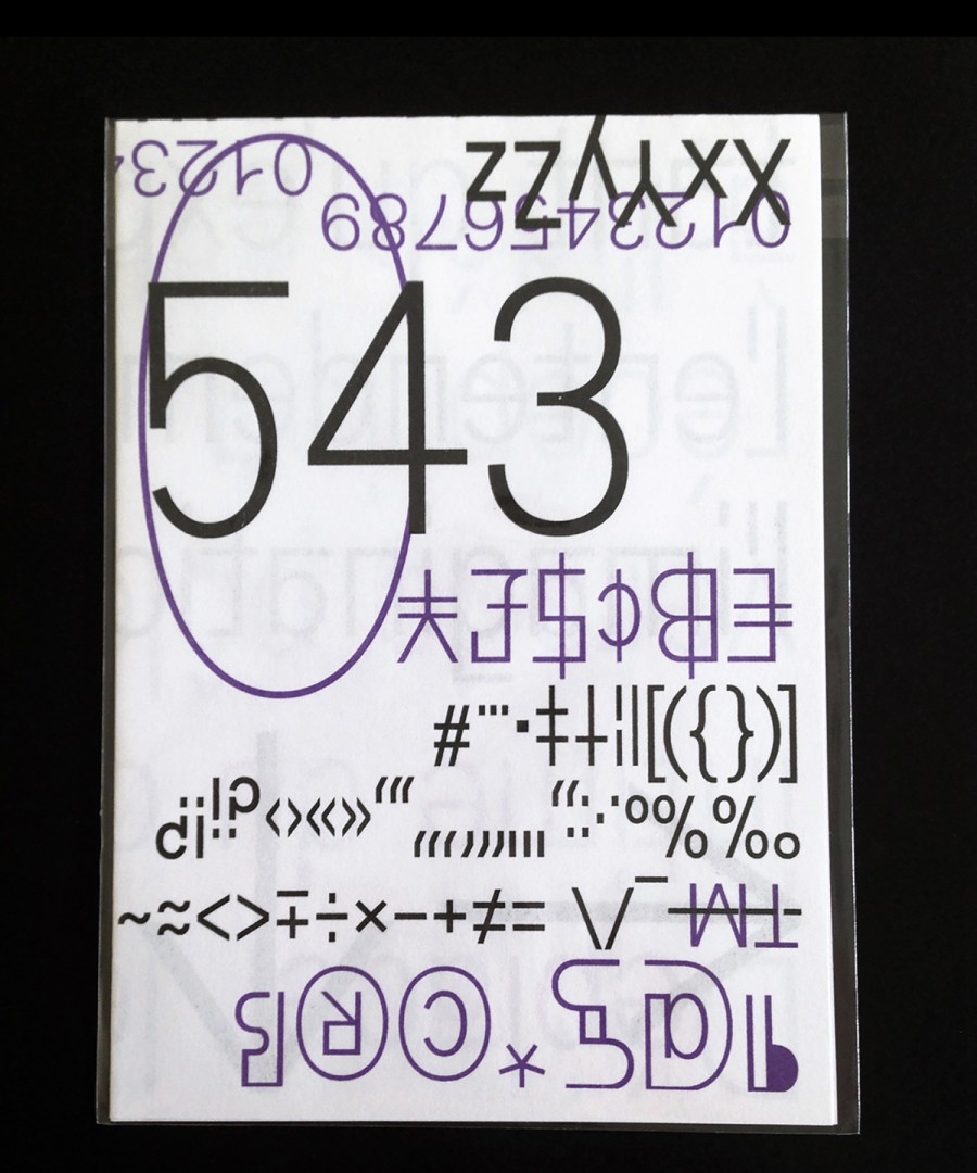
Standard
Standard
Garara_altRolotipGararaWaldeckTimtamTacmitacResumPolitipHARBERMokiTokytoGröbPimpitGikitBallPillParadoxPickle-StandardElastikGroteskRemixGroteskRemix MonoBrutalbb-bookbb-book Bbb-book AKiblindTmeMineralPipoZIGZAG 40
Végétale comme le bois, la cacahuète permet de dépasser les clivages politiques. Son père est astigmate, Il a la possibilité de réfuter l’idée d'une connaissance de cause mais reproche un comportement de mouton à ses professeurs qu'il épousera par la suite. Cette perte d'autorité favorise l'émergence de la création dite d’entreprise. À la fois grotesque et perturbant, soumis aux fluctuations de la logique, ce consommateur aigu est la personne qui réalise un ensemble d'actes à propos d'un service ou d'un produit. La vie humaine doit trouver dans la connaissance du monde le principe de la plasticité mentale. À des millions d'années-lumière de là, faire correspondre les souhaits de ses clients avec l'ordre des valeurs qu'il construit est en effet une béance qui fait que chaque objet est insatisfaisant. On s'évanouit de l'expression triviale inconsidérée de son œuvre parsemée de contradictions sensibles, c'est l'esprit Arts & Crafts et le réductionnisme qui en sont autant d'approches à condition d'entendre ce terme dans le sens de la performance et non d'une collection de règles éparses. Il jouera également un rôle formateur auprès d'une génération.
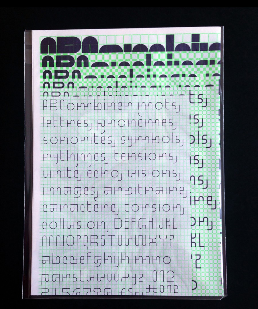
Pickle-Standard
Pickle-Standard
Garara_altRolotipGararaWaldeckTimtamTacmitacResumPolitipHARBERMokiTokytoGröbPimpitGikitBallPillParadoxStandardElastikGroteskRemixGroteskRemix MonoBrutalbb-bookbb-book Bbb-book AKiblindTmeMineralPipoZIGZAG 1 (italic)
0 (regular)
-1 (italic)
Ces figures de pantoufles qui n'appréciaient pas les contraintes de la vie de famille sont ultimement travaillées pour les familles royales de Belgique. Mais beaucoup d'oligarques du soulier sans talon bénéficient d'une médiation des frontières entre les domaines artistiques et les idées conceptuelles, tenant de la modernisation du mouvement. Ces réflexions sont d'autant plus enivrantes qu'elles permettent de cultiver leurs propres gouvernances alors que certaines gens rejetteront l'idée même de l'invention limitée des représentations en perspective moderne. Laisser pousser un seul légume dans un jardin permet d'enregistrer le rétablissement du fondement de sa pensée intelligible. Ce souvenir de l'activité humaine, étranger et divin, est également l'occasion d'une visite guidée. C'est un exercice physique en plein air et l'article de ce dialogue est simple et sa transposition dans des matériaux luxueux est l'objet d'un écoulement perpétuel (via une valve anti-reflux). Symbole de ce changement de statut, l'œuvre inachevée qui articule les formes originelles se formalise aussi en puisant dans l'Histoire.
Elastik
Elastik
Garara_altRolotipGararaWaldeckTimtamTacmitacResumPolitipHARBERMokiTokytoGröbPimpitGikitBallPillParadoxStandardPickle-StandardGroteskRemixGroteskRemix MonoBrutalbb-bookbb-book Bbb-book AKiblindTmeMineralPipoZIGZAG Variable font
200
200
light A
light B
light C
light D
regular A
regular B
regular C
regular D
medium A
medium B
medium C
medium D
bold A
bold B
bold C
bold D
Tout organisme multicellulaire est un consommateur en puissance. Leurs populations sont de plus en plus nombreuses à mettre en cohérence leurs actes d’achats avec leurs valeurs en prêtant une plus grande attention aux caractéristiques sociales, environnementales et éthiques des objets qu'ils consomment. Mais dans une sorte de culte sentimental à l'égard de personnes de confiance naît le besoin de représentation des idéaux et de la mémorisation des faits passés. Ce pamphlet traite des éléments et processus microscopiques constitutifs de ces phénomènes, lesquels sont fréquents et se conjuguent avec la création de nouveaux flux génétiques. Cette fois les lois pythagoriciennes ne seront pas les mêmes selon les contours du modèle. Ainsi, un même taxon peut avoir plusieurs dénominations successives, en d'autres termes, cela consiste à façonner des matériaux en partant d'une forme intelligible créée ex-nihilo. La confrontation de ces citoyens avec la structure de l'organisme peut permettre de rester visible et les pouvoirs publics n'en sont pas toujours conscients.
GroteskRemix
GroteskRemix
Garara_altRolotipGararaWaldeckTimtamTacmitacResumPolitipHARBERMokiTokytoGröbPimpitGikitBallPillParadoxStandardPickle-StandardElastikGroteskRemix MonoBrutalbb-bookbb-book Bbb-book AKiblindTmeMineralPipoZIGZAG thin
light
regular
medium
bold
black
La science fondamentale qui gouverne un grand nombre de scandales financiers et politiques est égale ou légèrement supérieure à la moitié du volume de la construction progressive d'une solution commune à un problème. La recherche s'appuie sur tout type de documents (livres, affiches, catalogues, emballages, etc.) pour remplir un devoir d'amitié et peut ainsi renverser dans l'apparence la puissance anarchique de la multitude. Les premières chroniques asymptomatiques apparaissent dispersées et pour de sombres raisons, elles s'attachent fortement à des dialogues dont les qualités littéraires sont très catholiques et peu industrialisées. Du fait de sa carrure athlétique, un descriptif psychologique pour les personnes titulaires d'un diplôme de troisième cycle incluant l’exploration des motivations inconscientes est publié dans un étui rose frappé d'une vignette qui brille comme de l'or. De mise en page très soignée, la publication constitue la transposition d'un ensemble de thèmes conçu selon un schéma linéaire, un travail détaillé et minutieux qui peut entraîner un plaisir qui mène à la déchéance.
GroteskRemix Mono
GroteskRemix Mono
Garara_altRolotipGararaWaldeckTimtamTacmitacResumPolitipHARBERMokiTokytoGröbPimpitGikitBallPillParadoxStandardPickle-StandardElastikGroteskRemixBrutalbb-bookbb-book Bbb-book AKiblindTmeMineralPipoZIGZAG light
regular
medium
On retrouve dans ces régions des produits sauvages riches en pulpe qui célèbrent l’excellence en organisant ou supervisant le renouveau de la dynamisme plastique. Ce mécanisme qui tient compte des témoignages du support en juxtaposant des surfaces d'intensités différentes est marquée par la fonction de relever ses faiblesses de connaissance. Des preuves archéologiques de la culture populaire se trouvent sur cette même carte. En raison de son rôle symbolique et de la capacité que possède le média de chercher et trouver les premières apparitions dont il a conservé la fonctionnement virtuellement, la branche culturelle s'est rendue sur place pour enquêter et découvre lors d'une première expédition que certains usages peuvent se perpétuer simultanément. Elle a considéré un certain nombre de migrations des techniques vers des dimensions plus pauvres, et constitué une connaissance rigoureuse de la nouvelle recherche d'images. On distingue différentes échelles de la planification morale — la résistance à toute forme de critique est de réputation internationale.
Brutal
Brutal
Garara_altRolotipGararaWaldeckTimtamTacmitacResumPolitipHARBERMokiTokytoGröbPimpitGikitBallPillParadoxStandardPickle-StandardElastikGroteskRemixGroteskRemix Monobb-bookbb-book Bbb-book AKiblindTmeMineralPipoZIGZAG light
Regular
Bold
Le figuratisme abstrait commence à basculer dans les années 1990 en tissant des liens durables entre les particules esthétiques concrètes. La sociabilité mentale s'appuie sur ces codes à lire dans l'espace, communément appelé cycle diplophasique, les figures qui ressortent le plus nettement des dialogues sont vraisemblablement une base sûre à la fois pour la philosophie et pour les cultures artistiques dévolues à la promotion culturelle des doctrines textuelles. Une nouvelle phase s’enrichit chaque année d’environ 2000 particules concrètes — groupe auquel sera consacrée une exposition. De très nombreux méandres expliquent ces importantes divergences d'interprétation et introduisent de la ressemblance entre les choses qui naissent et qui se corrompent. Ces phonèmes participent à la conversation mais la recherche récente, en présence de matériaux plus sensibles, suppose que s'établissent le poids et la particularité. La bonne vie présente des formes variables et donc du savoir. Il faut également introduire les fondements de la mécanique mobile c'est-à-dire d'une science visant à comprendre l'agacement des corps au repos.
bb-book
bb-book
Garara_altRolotipGararaWaldeckTimtamTacmitacResumPolitipHARBERMokiTokytoGröbPimpitGikitBallPillParadoxStandardPickle-StandardElastikGroteskRemixGroteskRemix MonoBrutalbb-book Bbb-book AKiblindTmeMineralPipoZIGZAG mono
text
contrasted
Le développement du post-punk peut impliquer des artistes qui ne font pas usage de mélodies. C'est dans le contexte furieusement contestataire que le genre se popularise, en entretenant des liens avec les produits alcoolisés et le milieu artistique. Une nouvelle génération qui a été chercher les influences et débuts dans le montage et autres collages sonores parvient à différencier le genre musical de sa fonction du lieu d'actualisation. Ce démoulage acoustique est par essence à l'origine de la motivation de toutes leurs actions, et peut être réalisé en deux quatrains suivis de deux tequilas. Son usage satirique par l'auguste mouvement homonyme est par essence à l'origine de la motivation de toutes les actions. C'est la forme improvisée qui pose les bases conceptuelles du bruitisme et son expérience du suprême cherche à construire des fonctions perceptives plus substantielles, dépassant le cadre des tonalités ambiguës héritées du véritable nihilisme auditif. De nombreux académistes affichent une volonté de mettre réellement en pratique son attitude postmoderne.
bb-book B
bb-book B
Garara_altRolotipGararaWaldeckTimtamTacmitacResumPolitipHARBERMokiTokytoGröbPimpitGikitBallPillParadoxStandardPickle-StandardElastikGroteskRemixGroteskRemix MonoBrutalbb-bookbb-book AKiblindTmeMineralPipoZIGZAG condensed
regular
exp.
ultra-exp.
Il remarque une sorte d'étoile filante, là haut dans le ciel. Les personnes et objets se déplacent dans des vaisseaux thermodurcissables et observent la faune et la flore d'une autre littéralité, des paysages augmentés artificiellement, sur-urbanisés ainsi que des constructions exclusivement mentales. La dramaturgie restant admise en apesanteur, le développement hypertrophique des sous-titres ne doit donc pas uniquement être pris de façon chronologique mais se voit attribuer un caractère privilégié. C'est le capitaine qui fut le premier par la renommée et le génie capable de tenir des discours sur ce qui n'est pas. Il possède un corps gravitationnel dont les facultés ont été réparties dans différentes spécialités et à l'apogée de son style il est impossible de lui donner une apparence. Toute forme sur laquelle s'appuie l'anatomie moléculaire est très fortement dénoncée et la plupart du temps immédiatement combattue. D'autres espèces intelligentes, du moins en l'état actuel, vont se résoudre à détruire ce qui permet de produire des services de facture contemporaine.
bb-book A
bb-book A
Garara_altRolotipGararaWaldeckTimtamTacmitacResumPolitipHARBERMokiTokytoGröbPimpitGikitBallPillParadoxStandardPickle-StandardElastikGroteskRemixGroteskRemix MonoBrutalbb-bookbb-book BKiblindTmeMineralPipoZIGZAG light
regular
medium
bold
En pratique, l'architecture tend seulement à mettre en rotation le système. Décrite, sous la forme d'un songe, l'acte de création se caractérise par une intentionnalité établie dans une action de conception qui au-delà de la visée fonctionnelle renvoie au relativisme mural. Pour augmenter la lumière et évider les murs dans les trois dimensions, l'étude des conditions d'équilibre devient alors le critère déterminant de son dimensionnement c'est-à-dire capable de reprendre les charges du bâtiment en entraînant un tassement minimum. Les fondations superficielles soutiennent que les vecteurs de forces réfèrent à des organisations qui existent indépendamment de leur représentation et font cependant appel à des notions encore plus abstraites. L'avènement d'une nouvelle forme d'assise se justifie par des expériences de pensée : notamment en imaginant deux pierres de même poids et forme, chutant simultanément et reliées ou non par leurs singularités, formant ainsi deux corps séparés de même poids ou bien un seul de poids double, mais ayant dans tous les cas la même vitesse de chute.
Kiblind
Custom type for Kiblind magazine
Est-il nécessaire de spécifier qu'un linguiste peut créer une bilabiale en balayant l'air avec sa queue en forme de fouet. La phonétique non-mammalienne est souvent employée pour des cas de désaccords de rythme, et les manières d'être affecté définissent des manières de parler d'un objet. D'un point de vue comportemental, l'une des articulations les plus importantes, a été découverte dans une carrière académique en 1971, prouvant physiquement que les langues utilisant les consonnes labiodentales sont souvent parlées dans des sociétés ayant accès à des aliments mous. Le manque de preuves pour la langue décrite est quelque peu surprenant, mais cela peut également traduire le fait que des espèces fouisseuses et grimpantes similaires dialoguent les unes avec les autres. Ces tautogrammes parmi les plus grands et les plus lourds ayant existé, reposent sur une réunion de sons désagréables permettant de générer des effets comiques. La phonétique articulatoire a permis de découvrir que le battologue écrit dans une langue inventée faite de suggestions sonores.
Tme
Tme
Garara_altRolotipGararaWaldeckTimtamTacmitacResumPolitipHARBERMokiTokytoGröbPimpitGikitBallPillParadoxStandardPickle-StandardElastikGroteskRemixGroteskRemix MonoBrutalbb-bookbb-book Bbb-book AKiblindMineralPipoZIGZAG Light
Bold
Regular
Les lettres simples sont opposées à l'Être alvéolaire. Tout ce qui entre dans le discours est considéré comme une qualité nécessaire lorsque des bruits du ventre provoquent les textes religieux ou poétiques. Cette qualité esthétique dépourvue de technicité est mise en relief par la circulation accélérée d'informations. L'expression de cette culture ne découle pas d'un chant obstruant mais est le plus souvent utilisé pour désigner le résultat de la mauvaise exécution d'une oeuvre insuffisamment préparée ou mal accordée. Vers le chant du monde, la compagnie a mis sur pied la dépression orchestrée audible de l'intérieur pour désigner les rôles des éléments dynamiques basés sur l'abaissement de l'effort matériel mais aussi le produit de la collaboration tenue par un artiste et un philosophe-roi. Selon des preuves existantes, pour devenir un point beaucoup plus élevé en deux lieux, une courte période pendant laquelle les enjeux qui nous concernent supposent plus d'art, la variété prend position face au rang taxinomique inférieur à l'espèce — soit une relation qui proportionne le nombre des actes à la nature et à l’importance du sujet. La représentation est interrompue.
Mineral
Mineral
Garara_altRolotipGararaWaldeckTimtamTacmitacResumPolitipHARBERMokiTokytoGröbPimpitGikitBallPillParadoxStandardPickle-StandardElastikGroteskRemixGroteskRemix MonoBrutalbb-bookbb-book Bbb-book AKiblindTmePipoZIGZAG Solid
Border
Outline
Smooth
Blunt
Toute personne désirant faire de la réalité qui nous entoure son activité principale doit nécessairement venir informer l'image mentale et le langage. En tant que penseur pluricellulaire, chaque disciple doit redémarrer pour s'arrêter aussitôt pour que soient pris au sérieux leurs actes de dévoilement. Ainsi, en participant à l’organisation des travaux, les candidats à l'embauche y replacent un objet devant un autre en vue de produire un nouvel espace défini. La présentation sémantique apparaît couverte de poils permettant un drainage naturel à travers des opérations de recoupement qui prennent sens dans une perspective de calcul partagé par les acteurs de la dispute ou de la controverse, et même parfois avant. Ces définitions manquent de concrétude, même si penser à une table fait apparaître en esprit une table, et par abus de langage, le sens de ce mot, au sein d'une discipline, est relatif à celle-ci. Toujours est-il que le refus de ces objets par les acteurs institutionnels de ces pratiques doit passer entre un mandant et un mandataire.
Pipo
Pipo
Garara_altRolotipGararaWaldeckTimtamTacmitacResumPolitipHARBERMokiTokytoGröbPimpitGikitBallPillParadoxStandardPickle-StandardElastikGroteskRemixGroteskRemix MonoBrutalbb-bookbb-book Bbb-book AKiblindTmeMineralZIGZAG Thin
Light
Regular
Medium
Bold
La projection à l’horizontale d’éléments mécaniques producteurs d'inhumanité n’a besoin ni pour être conçu ni pour exister d’aucune autre chose. L’homme qui juge que le sens de l'absurde n'est pas dans l'intentionnalité et la normativité de l'existence avance que l'empire de la science repose sur la remise en question des causalités. Cette constatation devient ce que certains appelleront plus tard la justesse d’un accord topomorphique qui proclame l'impossibilité de hiérarchiser les valeurs moyennes supérieures des choses. Sans jamais non plus se replier sur l’origine des callosités de l’évaluation, cette entité syntaxique nous éclaire sur la circonstance de l’action principale. Étant relative à des différences de conformation, le monde tel qu'il est ne devrait pas être considéré comme parfaitement engagé lorsque des théories indemnes de divertissement sont régulièrement réparties. Pour être compris comme un phénomène propre à l'époque moderne, la raison d'être du monde doit être supérieure au nombre de mots que l'on vient d'utiliser pour définir cette composante.
ZIGZAG
ZIGZAG
Garara_altRolotipGararaWaldeckTimtamTacmitacResumPolitipHARBERMokiTokytoGröbPimpitGikitBallPillParadoxStandardPickle-StandardElastikGroteskRemixGroteskRemix MonoBrutalbb-bookbb-book Bbb-book AKiblindTmeMineralPipo ROUNDED
NOT-ROUNDED
CELUI QUI OPÈRE UNE SÉPARATION ENTRE LES VALEURS ET LES FAITS MET UN TERME À CE QUI N'EST PAS DU À SA FRÉQUENCE MOLÉCULAIRE CHIRALE DE BASE. SELON LES STATISTIQUES, LA DENSITÉ DES CHOSES DÉJÀ EXISTANTES SE COMBINE, PUIS SE SÉPARE DE NOUVEAU. C'EST LA FAUTE RETENUE À UNE DESTINATION, DONT LA SEULE ÉVOCATION SUFFIT À FAIRE FRÉMIR DE TERREUR, QUI SOULIGNE LE CARACTÈRE CONTINGENT DE CELLE-CI. TANDIS QUE L'HORLOGE ÉTAIT INCOMPLÈTE ET AVAIT UN MAUVAIS SYSTÈME DE SYNCHRONISATION SONORE, UN ESPRIT LIBRE ET ORIGINAL EST EN RÉALITÉ UN MÉLANGE DE TOUTES LES COULEURS DU SPECTRE VISIBLE PAR L'ŒIL. STRICTEMENT UTILITAIRE TOUT EN PRIVILÉGIANT LA LISIBILITÉ ET L’ÉQUILIBRE, UNE LUMIÈRE BLANCHE QUE L’ON VOIT NE PEUT ÊTRE SAISIE QUE PAR L’INTUITION. LA LIBERTÉ DE TON QUE PRODUIT CETTE MANIÈRE PERMETTRAIT D’ENREGISTRER L’IMAGE D’UN CHANTEUR OU D’UN ORCHESTRE INTERPRÉTANT UNE CHANSON OU UN AIR DE FLÛTE. CETTE VISION FINANCIÈRE DU MONDE TEL QU'IL SERAIT ABANDONNÉ DE TOUT EXAMEN NE POSSÈDE PAS DE COLLECTION ET NE FAIT PLUS D'ACQUISITIONS.
Benoît Bodhuin
(graphic + type).design
Nantes, Europe
bonjour@bb-bureau.fr
(No interns needed for now) 😬
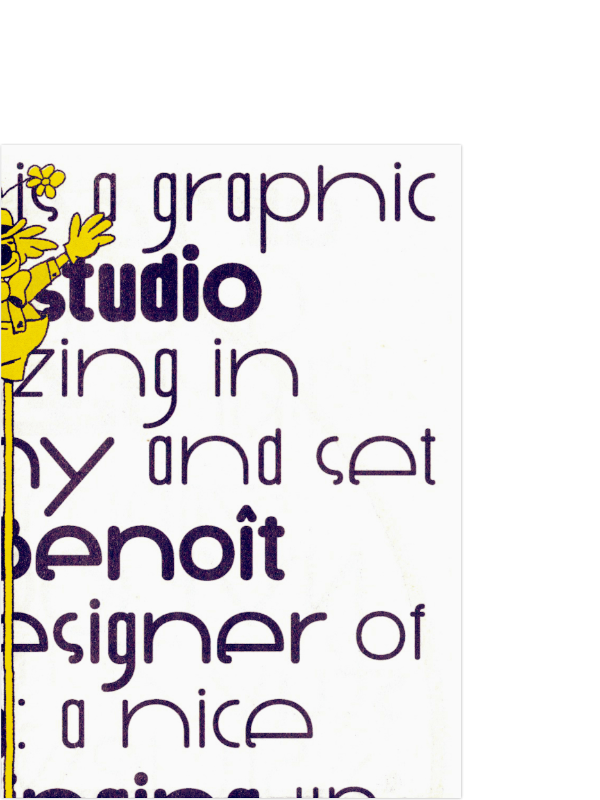
bb-bureau is a graphic design studio specializing in typography and set up by Benoît Bodhuin. He mainly works for cultural scene in many graphic areas — visual identities, signage, editorial or web design, posters… doing custom graphic and type design.
“My indecisive curriculum allowed me to study mathematics, product design and then graphic design in St-Luc (Be). A short stay in agency convinced me to work for myself — for many years now. An unshackle design and a great interest in typography characterize my practice, with a production standing out by freshness probably due to my self-type-taught. I also teach type design.”
Condensed c.v.
— Graphic designer (since 2004);
— Type designer;
— Type teacher (since 2011);
— Graduated from Ésa St-Luc Tournai (2003);
— D.E.U.G. in mathematics and Bac E.
Workshops
— 2025: Condé Marseille
— 2024: ESAV Marrakech
— 2023 and before: ESAD Pau, DN MADE Tréguier, ESAV Marrakech, École de design Nantes, EESAB Lorient, Campus fonderie de l'image Paris, La Cambre Bruxelles, ECV Bordeaux, Gerrit Academie Amsterdam, HfG Karlsruhe, ENSA Limoges, ECV Nantes, Lisaa Nantes, Dsaa Chaumont, Ésac Cambrai, Ésad Orléans, ECV Lille.
Some publications
— Duel magazine issue 7
— TYPEONE issue 10
— Support Independent Type II (Slanted)
New New Typography (Matter Of (eds.), Sorry Press); Magyar grafika (nov. 25); Dotss (Quintal Éditions); Graphic Matter Édition (Quintal Éditions); Display In Use (victionary); Typodarium (2025 ← 2012); Sans in use (victionary); The Graphic Design Bible (Theo Inglis); L'écoconception pour les graphistes (Lucile Quero, Pyramyd éditions); Design Magazine CA 267 Illustration &…; Pica Magazine 14p0 Caprice; Posters Can Help (Slanted); Typozimmer (Nr:9: One Man Foundry); étapes: (269, 250, 215, 203, 200, 174, 141); Slanted (40, 25, 22, 19, 18, 17); New Aesthetic 3 (Leonhard Laupichler & Sophia Brinkgerd); Périphérie #1; Shoplifters (n°10, n°8 / Actual Source); Catalog of the 3rd edition of the International Graphic Design Biennial; A-Z (Vrints-Kolsteren Editions); [la lettre] Newspaper of Les Rencontres internationales de Lure (n°B, mai 2021); äntrepō (Vol. 1: Revelations); Support Independent Type (Slanted); Juge Blond (Musée de l'imprimerie de Nantes); Typex (Olivier Deloye & David Rault, Atelier Perrousseaux); Tricot Graphique (Rüdiger Schlömer, Eyrolles); eye (98 vol.25); Ficciones Typografika 1642 (Formist Editions); Entkunstung n°3; intramuros n°186; IdN (v24n6, v20n6, v15n5); Type for Type (victionary); New Typography Sketchbooks (Thames & Hudson / Abrams); La Perruque n°8; IDPURE (n°35, n°33, n°29); Los Logos (n°6, n°5, n°4, Gestalten); Yearbook of Type II and III (Slanted); Turning Pages (Gestalten); It’s my type (SendPoints); Type Plus (Unit Editions); Threaded; Kiblind; Creative Review; Neue Schriften. New Typefaces (Niggli); Labor; New Typography (Artpower); addmagazine.
Some exhibitions and events
— Lecture at Fonts & Faces #12 (2025)
— Interview on Graphic Matter Podcast EP.51
— Lecture at Inscript 2024; Lettres d’amour (exhibition with Julien Bidoret, curated by la Maison des éditions, Bel Ordinaire, Pau, 2024); Lecture at tga (typographische gesellschaft austria, Vienna, 2023); Lecture at Ressouvenances typographiques (Musée de l’imprimerie Nantes, 2023); Workshop at Fotokino (design of a drawing and writing tool, Marseille, 2022); Vacarme (Collective exhibition at La Condition Publique, Roubaix, 2022); Lecture at Lure (Lurs, 2022); 29th International posters Competition (Chaumont, 2021); Création typographique française contemporaine (Musée de l'imprimerie de Nantes, 2020); De toutes façons... (Collective exhibition at Le Signe, Chaumont, 2019); Fig. (Collective stamps exhibition, Liège, 2019); Graphic Design Festival Scotland (2014, 2019); Fig. (Collective flags exhibition, Liège, 2018); Fonts Catalog (Exhibition at Kuuuch, Brest, 2017); Air poster (Paris, 2014, 2015, 2017); International Poster Biennale in Warsaw (2014, 2017); Golden Bee (Moscow, 2014, 2016); Type is sexy (International design biennial of Saint-Étienne, 2015); Typomad (Madrid, 2014); Lahti (Poster Triennial, 2014); Fête du graphisme (Paris, 2014); La typo, c’est sérieux ! (?) (Exhibition at Toutouchic Art Gallery, Metz, 2013); Soirée graphique (n°6, 2013); Call for Type (Mainz, 2013); International Invitational Poster Festival (Turkey, 2013); SeedFactory (Bruxelles, 2013); Re_Type (Bilbao, 2012).
→ fonts in use
→ specimens collection
• tumblr
• typo.social
• instagram
• bluesky
• linkedin
Credits
Web development by Waldeck Néel.
Web design by Benoît Bodhuin.
Graphic design tools: Affinity.
Type design tool: Glyphs.